
Hi there! Abigail here with a 2020 web design trend forecast, and it’s particularly sunny for businesses looking to stand out authentically on the web since it’s all about balancing the quirks that make your company unique and personable with reliable professionalism.
1. Fun Icons and Line Variety
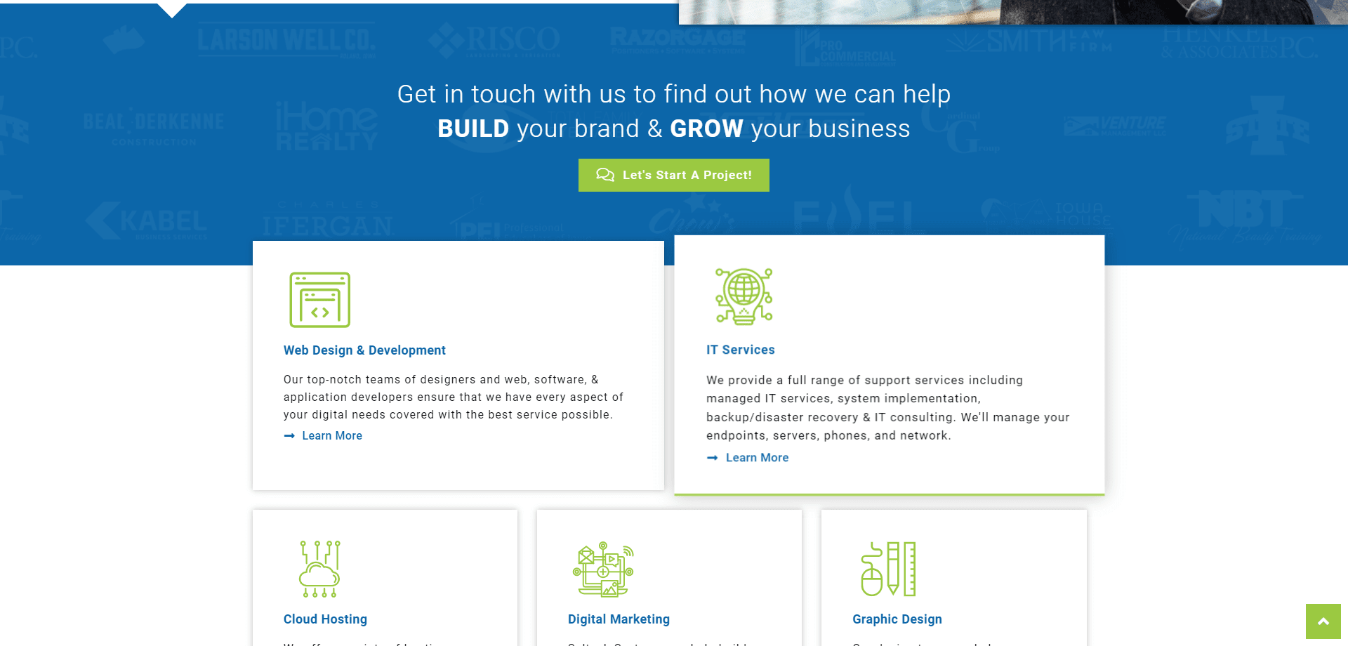
The trend explained: Animation and vector line art have been gaining popularity in recent years, both in web design and in other entertainment mediums (Into the Spiderverse, anyone?). We can use icons to quickly communicate with users things like where a button will take them or what a section of text will be describing. Adding unique illustration details to icons can make your brand subtly more memorable for the users. On our Saltech website, we used detailed icons for each category of services we offer to establish our brand style.
Having a variety of lines dividing the sections on your website, specifically to underline navigational elements, makes the experience more fun for the users since the brain likes to see subtle variety and cues of where to go next.
How to use it: Pay extra attention to the design of your website’s icons! If illustrations fit your company, emphasize this in your logo and keep the style consistent across your website. Use a variety of lines like overlapping, grids, arrows, or underlines to subtly lead the user throughout the content on your website.
Don’t overdo it: Avoid getting too clever with your website’s icons. The user should immediately understand what the icon represents, otherwise, they’ll spend more time trying to decode a small image than they will spend learning about your business.
2. Video/Drone Footage and Sweeping Imagery
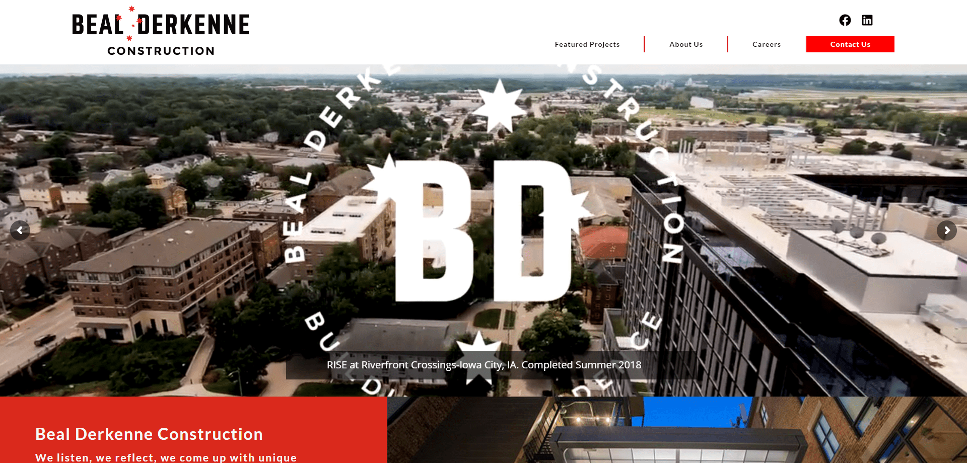
The trend explained: This is a continuation from last year’s design trends! Big, sweeping images at the top of your homepage draw the user into your website and your company. A new variation of this is video footage, and with new technology, drone footage. By showing people’s expressions in videos, you portray a certain emotion and tone for your brand. Sweeping landscapes and interior shots showcase your space, while close shots of your work process show your company’s attention to detail. The BD Construction website uses a variety of drone footage on their landing page to showcase some of their projects. They start with sweeping birds-eye shots and move into the interior details of each building, establishing their design style in a matter of seconds.
How to use it: There are a variety of applications depending on your industry. Real Estate websites can showcase specific properties, parks and cities can sweep over their location and the people enjoying it, companies offering specific services or equipment can give a 360 degree tour of their best equipment, and so on.
Don’t overdo it: Make sure you’re not sacrificing your loading speed for videos. Since most users will have a goal in mind when they land on your website, they’ll only see the video for as long as it takes them to find the link or information they’re really looking for.
3. Gradients and Bold Colors
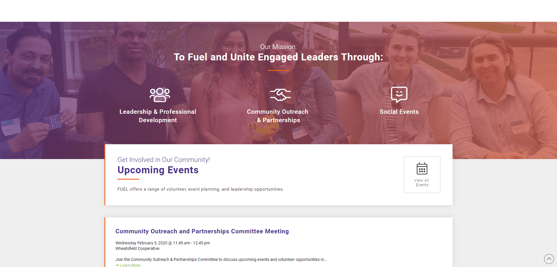
The trend explained: What pairs well with sweeping images and videos? Sweeping gradients and bold colors! Bold colors can help direct the user to important links and information, while gradients add visual interest and continuation between sections of content. In the FUEL website, the purple > orange color gradient reiterates their bold accent colors in a less intense way that makes the mission section cohesive with the events section.
How to use it: Use soft gradients between sections of content or layer over background images. Use one-two bold colors from your company’s color scheme for buttons and links to help them stand out for the user.
Don’t overdo it: Bold colors and gradients are excellent additions to websites in moderation. Be careful to use these to only emphasize important information or to help lead the user to the important information quickly.
4. Contrasting Color Schemes
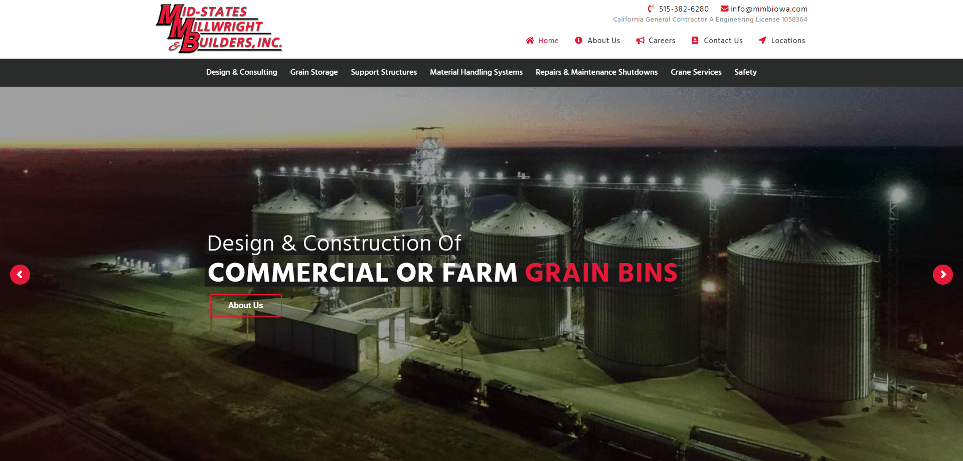
The trend explained: The contrast of opposites always attracts the eye, especially when you combine the simplicity of a black and white color scheme with a bold accent color. This adds depth to your design and helps divide up the sections of content on your website. As you can see above in the MMB Iowa website, keeping the color scheme black and white with red icons and accents helps break up the links on the page so they’re less overwhelming.
How to use it: Stick to a neutral color palette with one bold accent color. Use the contrast to divide sections of content on your website (like navigation), and use the accent color to make icons, important keywords, and navigation stand out.
Don’t overdo it: The key to balancing contrast is spacing out contrasting elements. Don’t alternate too quickly between heavily contrasting sections of content as that can exhaust and overwhelm the user’s eyes.
5. Responsive Grids
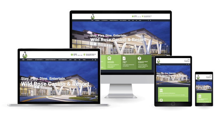
The trend explained: Now more than ever users are going to websites from a variety of devices with a variety of screen sizes. Designing webpages with a responsive grid ensures that content doesn’t just “fit” into each screen size but looks purposefully aligned within the screen. Each element and content section on the City of Jefferson website resizes and realigns to fit differing screen sizes so users can easily find the information they’re looking for as they’re visiting the city. Responsiveness is also great for search engine optimization.
How to use it: Make sure every element, image, and section of your website is responsive and resizes well. Decide which elements are necessary for smaller screens vs. bigger screens as you’re designing with the user in mind.
Don’t overdo it: Don’t try to fit everything from the web-browser sized website into the mobile website. Videos, interactive elements, and other parts of the web browser website take longer to load on mobile devices and can get in the way of the user’s navigation. Keep your grid flexible but decide which elements are necessary for smaller screens and which should be replaced at a certain screen size.
Summary
From illustrated icons and bold accent colors to inviting videos and responsive grids, this year is going to be filled with exciting websites. Here at Saltech we stay on top of web design trends so your website can stand out to your customers!
