Let’s cut to it:
Your homepage isn’t there to tell your life story. It’s not a sales deck, a resume, or a storage unit for every idea you’ve ever had.
It’s a navigation hub. A split-second decision point. If users don’t understand what you do, who you do it for, and what to do next—they bounce. No second chances.
Trying to say everything at once? You’re saying nothing effectively.
What Your Homepage Is Supposed to Do
At its core, it has one job: guide the visitor toward action.
That action could be:
- Booking a consultation
- Viewing your services
- Making a purchase
- Learning more about your company
But none of that happens if your homepage is cluttered with walls of text, endless sliders, or a confusing layout.
A strategic homepage answers three questions immediately:
- What is this?
- Is it for me?
- What do I do next?
If your homepage doesn’t nail those, your traffic is just noise—not leads.
What Happens When You Try to Say Too Much
You’ve seen it before: homepages with ten navigation buttons, paragraphs of company history, five competing CTAs, pop-ups, chatbots, and a scrolling ticker for good measure.
And here’s what actually happens when a homepage is overloaded:
- Cognitive overload: Users feel overwhelmed and unsure where to go.
- Increased bounce rate: When people don’t see value fast, they leave.
- Slower load times: More images, animations, and scripts drag your site speed down.
- Diluted SEO signals: A homepage without a clear focus ranks for nothing.
- Mobile mess: Busy designs don’t translate well to small screens.
Trying to do too much at once costs you conversions, visibility, and user trust.
Clean Design Isn’t Just About Aesthetics—It’s Strategy
Let’s be clear: this isn’t about minimalism for the sake of looking trendy. This is about function.
A clean homepage:
- Loads faster
- Guides attention strategically
- Feels modern and credible
- Performs better on mobile
- Converts more users with less noise
When everything is shouting for attention, nothing gets heard. Simplicity allows your core message—and call-to-action—to stand out.
So, What Should Go On a Homepage?
Here’s a no-nonsense homepage structure that works:
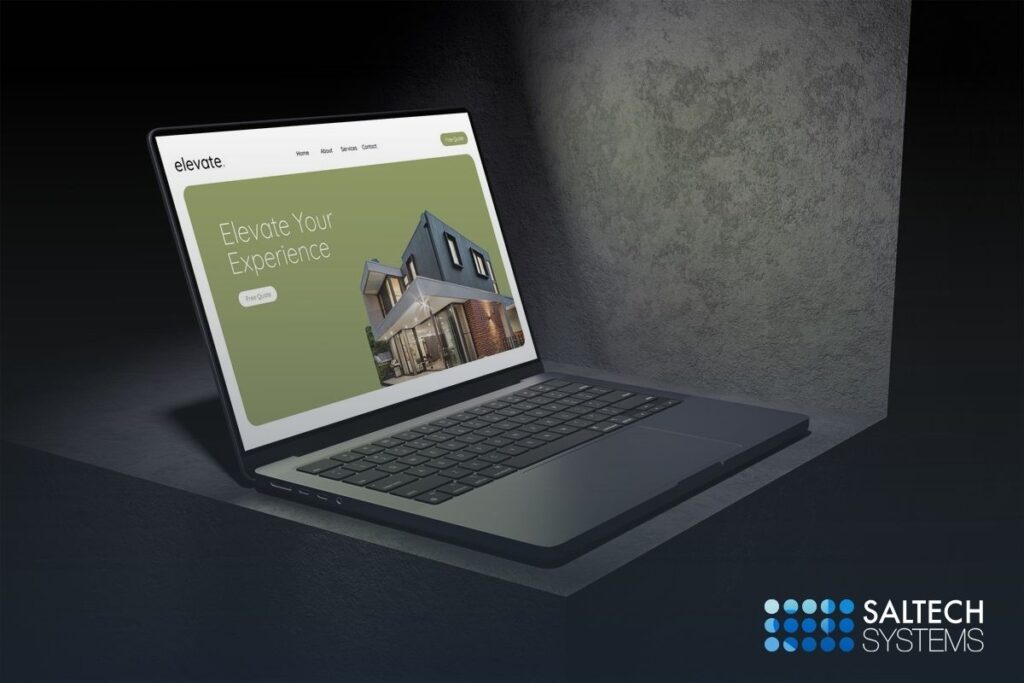
- Headline + Subheadline
Make it immediately clear who you are and what you offer. Not clever. Not vague. Just direct.
Example: “Custom Web Design That Converts — Built for Small Businesses Ready to Grow.”
- Primary Call to Action
What do you want users to do? “Get a Quote,” “Schedule a Demo,” or “View Services.” Pick one and make it clear.
- Service or Product Snapshot
Give users a quick visual of your main offerings. Use icons or quick links—not long paragraphs.
- Social Proof or Trust Indicator
A few logos, a testimonial, or a stat can go a long way: “Trusted by 200+ businesses across the Midwest.”
- Brief About Section
Just enough to build credibility—link out to a full About page if people want more.
- Secondary CTA (Optional)
Something softer: “Learn More,” “Browse Portfolio,” or “See Pricing.” Great for visitors not ready to commit.
That’s it. No clutter. No distractions. Just purpose.
The Homepage Hierarchy Test
Want to see if your homepage is doing its job?
Try this:
- Look at it for 5 seconds.
- Then close your laptop and answer:
- What does the business do?
- Who is it for?
- What should the user do next?
If you—or your team—can’t answer all three, it isn’t focused enough.
What You’re Risking By Saying Too Much
When your homepage tries to say everything, it starts working against you.
Instead of guiding visitors, it overwhelms them. Instead of building trust, it introduces doubt. People don’t know where to look, what matters, or what to do next—and when that happens, they leave.
You also lose speed. Bloated homepages with oversized images, endless sliders, and unnecessary content load slower—and slower pages mean higher bounce rates and lower rankings.
And let’s talk about your calls-to-action. When there are five buttons competing for attention, none of them get clicked. Your message is buried under the noise, and your conversions suffer for it.
Worst of all, your brand starts to look unfocused. Visitors might not say it out loud, but if it feels chaotic or dated, they’ll assume your business is too.
Bottom line: when your homepage tries to do everything, it ends up doing nothing well. Clear beats clever. Focused beats flashy. Simplicity earns trust—and trust converts.
Simplify to Convert
You don’t need to impress visitors with everything you’ve ever done. You need to guide them.
Your homepage should be a streamlined launchpad into your site—not a chaotic directory of content. Simplify it, focus it, and let it do its job: convert.
Ready to Strip the Fluff?
At Saltech Systems, we design homepages that move fast, say less, and perform better. If your homepage is trying to do the most and convert the least—we’ll help you fix it.