
Take a look at your browser tabs or your mobile home screen. If you use Google Workspace, you have likely noticed that things look a little different. The familiar, flat, rigid geometric lines that defined your digital workspace have softened. Gmail looks like it has been run through a vibrant watercolor filter. Google Docs shifts from a flat corporate blue into a purple hue. Google Drive has shed its hard primary borders for an organic, dimensional glow.
Google is rolling out a massive visual overhaul across its entire Workspace ecosystem. For the first time since 2020, Google is systematically redesigning its core application icons—including Gmail, Docs, Sheets, Slides, Calendar, Meet, and Chat with a fluid, luminous “AI gradient” aesthetic.
This is not a superficial cosmetics change or design for the sake of novelty. It is a calculated, multi-billion-dollar brand repositioning. As Google transitions into an AI-first company, its visual assets must signal that shift to the world.
What is driving this shift away from flat minimalism, and what can marketers, brand strategists, and businesses learn from Google’s latest evolution? Let’s break down the mechanics of the AI gradient makeover and explore its profound implications for the future of digital design.
1. What Changed in the Google Workspace Icons?
To appreciate the new gradient design, we first have to look at the problem Google was trying to solve. In 2020, Google unified its Workspace icons under a strict design mandate: every single app icon had to be constructed from a hollow geometric outline containing all four primary brand colors (Google red, blue, green, and yellow).
While this created ecosystem unity on paper, it created a massive user experience nightmare in reality. At a small scale—like a browser favicon or a fast-paced notification tray—the icons became an indistinguishable blur of multi-colored wires. Users routinely complained about clicking Google Docs when they meant to open Google Calendar.
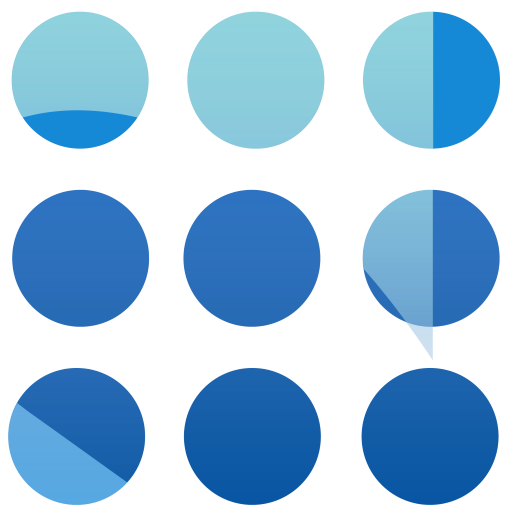
The new redesign completely abandons that rigid four-color rule in favor of distinct shapes and rich, dimensional gradients.
-
Ditching the Four-Color Mandate: Most individual apps have dropped the requirement to feature all four corporate colors. Instead, they are returning to a singular, dominant brand identity. For instance, Google Docs is predominantly blue, Google Keep focuses on its characteristic lightbulb yellow, and Google Calendar reclaims a bold, singular blue.
-
The AI Gradient Treatment: Rather than flat, solid color blocks, the new icons feature smooth transitions, depth, and translucency. Red bleeds into yellow, yellow into green, and green into blue.
-
Dropping the Page Container: Google has removed the restrictive, boxy “Workspace frame” surrounding many of its icons. This allows the core shapes—like the Gmail “M” or the Google Drive triangle—to be larger, rounder, friendlier, and significantly more distinct.
2. The Evolution of Google Branding: A Historical Timeline
3. Why Google Made This Change: Strategic Insight
When a company with billions of active daily users alters its visual identity, the decision is deeply tied to market positioning, psychological triggers, and ecosystem evolution.
The Death of “Blanding” and Flat Minimalism
For the past decade, the tech world was trapped in an era of intense design minimalism a trend critics frequently called “blanding.” In the mid-2010s, the internet demanded pure technical efficiency. Icons needed to load instantly on slow mobile connections, scale down cleanly into tiny notification grids, and remain entirely unobtrusive.
Every tech company, from Google to Apple to Spotify, flattened its logos into geometric minimalism. But as rendering engines, high-refresh-rate mobile displays, and processing speeds skyrocketed, those structural constraints disappeared. The minimalist look, once viewed as cutting-edge, began to feel cold, sterile, and corporate. Google’s move toward dimensional iconography is a definitive rejection of flat design, replacing it with a style that brings back warmth, depth, and tactile personality.
Signaling the AI-First Transition
How do you show a user that an app is smarter than it was yesterday? You can’t visually draw an algorithm, but you can change the visual energy of the application.
By applying the same soft, radiant gradient language found in its Gemini AI interface to everyday tools like Gmail and Google Docs, Google is subconsciously signaling to the user that intelligence is now baked directly into the software. The gradient is no longer just a color choice; it has become the universal design shorthand for the AI era.
4. AI Era Design Psychology: Why Gradients Symbolize Intelligence
There is a fascinating psychological reason why tech giants like Google, Microsoft (with Copilot), Apple (with Apple Intelligence), and Meta are all converging on gradients, translucency, and fluid curves to represent artificial intelligence.
The Psychology of the Aura: Flat colors represent fixed, static states. A solid blue square is predictable; it stays exactly within its boundaries. Gradients, however, imply movement, transformation, and adaptability. They mimic natural light, auras, and neural pathways.
Because generative artificial intelligence is inherently dynamic—constantly shifting, generating, and learning rigid geometric lines feel entirely wrong for it. Soft transitions and bleeding colors feel organic and “alive.” They evoke a sense of continuous energy, helping users perceive AI not as a cold, rigid database, but as a fluid, responsive, and creative assistant.
5. What Businesses Can Learn From Google’s Redesign
Your business might not have a budget or user base the size of Google, but the shift in consumer design expectations affects every industry. Here are the core branding and marketing takeaways from Google’s visual pivot:
-
Prioritize User Experience (UX) Over Rigid Brand Guidelines: Google’s 2020 icons were mathematically beautiful and perfectly cohesive on a brand presentation slide. But in the real world, they failed the usability test because they all looked identical. Never let strict brand uniformity break the actual utility of your digital products.
-
Lean Into Approaching, Human-Centric Visuals: If your business is launching software, tech services, or AI integrations, understand that the market is moving away from stark, intimidating tech aesthetics. Consumers are looking for software that feels warm, approachable, and intuitive.
-
Differentiate Through Dimension: If your competitors are still clinging to the hyper-flat, minimalist vector styles of 2018, you can instantly stand out by introducing depth, subtle lighting, and soft gradients into your marketing collaterals and web assets.
The New Aesthetic Frontier
Google’s Workspace icon makeover is a clear signal that the era of hyper-flat, sterile corporate design is officially drawing to a close. We are stepping into an aesthetic frontier defined by fluidity, organic color transitions, and human-centric depth a design ecosystem built specifically to make advanced artificial intelligence feel natural and integrated into our daily workflows.
As Google seamlessly blends its iconic color palette into a unified gradient, it issues a quiet challenge to businesses everywhere: Is your brand identity still built for the rigid, static digital landscape of the past decade, or is it ready to adapt to the fluid, fast-moving realities of the AI era?
Frequently Asked Questions (FAQs)
1. Why did Google change its Workspace icons?
Google updated its Workspace icons to address long-standing user complaints that the previous four-color geometric outlines looked too similar and were hard to distinguish at a glance. Additionally, the new gradient design visually aligns the Workspace apps with Google’s broader transition into an AI-first era, utilizing the design language of Gemini.
2. What is the AI gradient design trend?
The AI gradient trend is an emerging design aesthetic characterized by soft, blending color transitions, aura-like glows, and fluid shapes. Tech companies use it to represent artificial intelligence because the moving colors symbolize dynamic energy, adaptability, and continuous intelligence, moving away from the cold predictability of flat colors.
3. How does Google branding evolve over time?
Google’s branding evolves alongside its technical capabilities and corporate focus. It started with a playful, shadowed desktop search engine logo in the late 1990s, transitioned to flat geometric minimalism (Material Design) in 2015 to conquer the mobile app era, and has now evolved into dimensional, gradient-driven visuals to represent cloud integration and AI automation.
4. What is Material Design in Google products?
Material Design is a design language developed by Google in 2014. It combined clean typography and flat grids with subtle, realistic grid systems, shadows, and responsive transitions to mimic the physical attributes of paper and ink within a digital space. The latest gradient updates build on this framework by introducing more expressive, fluid layouts.
5. How does icon design impact brand perception?
Icon design acts as the primary visual handshake between a software product and a user. A cluttered or uniform design can cause cognitive fatigue and frustration, whereas a distinct, well-grouped, and dimensional icon layout can boost brand recall, convey innovation, improve daily user navigation, and foster deeper emotional trust.
To get a better understanding of how these design principles translate to real-world user interaction, watch this deep dive into the practical usability issues of modern app logos:
This video explores how Google’s historical design mandates impacted day-to-day app navigation, offering a clear visual breakdown of why the transition away from uniform, four-color guidelines became a functional necessity for the workspace apps.