
More Than Just a Symbol
Every four years, the world stops for football. But before the first whistle blows, before a single goal is scored, billions of people encounter the World Cup through something much smaller a logo.
A logo is never just a picture. It is a promise. It sets the emotional tone of an entire event, travels across billions of screens, and eventually becomes the symbol that a generation associates with a specific moment in time. Think about it: show almost anyone the 1998 France or 2010 South Africa World Cup emblem, and memories rush back instantly.
The FIFA World Cup 2026 logo carries that same weight but with a very different design strategy.
First Impressions: Clean, Bold, and Deliberate
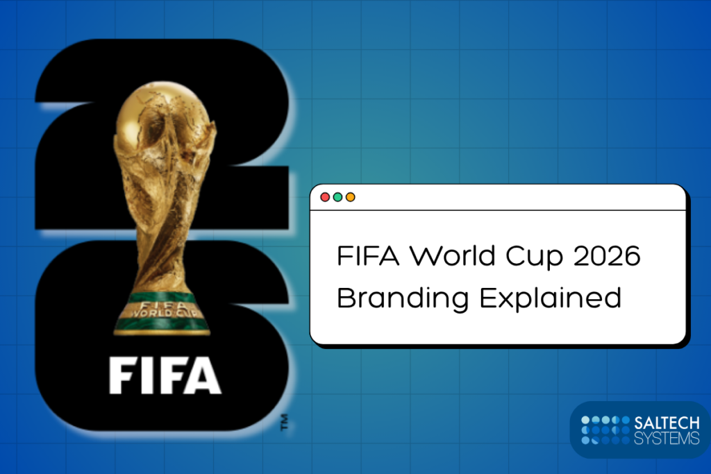
When you first see the FIFA World Cup 2026 logo, your eyes land on one thing immediately: the iconic golden World Cup trophy, sitting proudly inside the number 26.
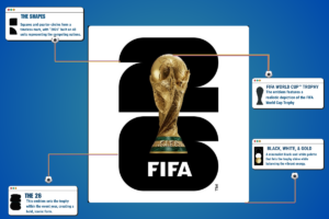
That is the whole mark. No elaborate illustrations. No swirling ribbons or cultural motifs. A photo-realistic World Cup trophy rests on a stacked “2” and “6,” set against a default black, white, and gold palette.
Previous World Cup logos often leaned heavily on artistic symbolism abstract shapes evoking a host nation’s culture, handcrafted typography, or illustrative figures. The 2026 mark strips all of that away. Many earlier World Cup emblems leaned heavily on illustration, mascots, or abstract shapes. The 2026 mark is more direct because it uses the trophy itself as the central visual object.
For some, this felt refreshing. For others, it felt almost too restrained. That tension is exactly what makes this logo worth analyzing.
The Design Thinking Behind the Mark
Here is something designers often say: the hardest thing to design is simplicity.
Getting a complex logo to look nice is achievable. Getting a simple mark to feel powerful that takes real skill.
The squares and quarter circles that make up the number 26 are not random shapes. They reference the squared edges of a football pitch and the circle of a ball, and the number is composed of 48 units of these shapes, representing the 48 competing nations.
Every element earns its place. That is the hallmark of disciplined design thinking.
The logo also solves a critical modern problem: it needs to work everywhere. A sports event identity today lives on phone screens, stadium signage, broadcast graphics, merchandise tags, social media thumbnails, and LED billboards. A logo loaded with fine detail falls apart at small sizes. The 2026 visual identity presents a minimal, adaptable monolithic mark embracing modern branding trends and marking an evolution from the tournament’s traditionally singular designs.
Clean geometry scales without distortion. It reproduces perfectly whether it is 16 pixels wide on a phone notification or 30 feet tall on an arena banner.
Branding Strategy: One Logo, Sixteen Stories
Here is where the 2026 approach becomes genuinely clever.
FIFA built the system so each host city could apply its own colors and patterns through the broader brand framework. Host-city brands adapt the official mark with local colors, patterns, and cultural cues rather than forcing one narrow tournament palette on every city.
Think of it like a blank canvas with a fixed frame. The central logo the trophy inside “26” remains consistent everywhere. But each of the 16 host cities fills that frame with its own visual personality. Dallas gets its own version. Mexico City gets its own. Vancouver gets its own.
The “26” acts like a blank canvas, changing color and pattern for each city in the tournament, allowing each place to add its own personal touch.
This is a sophisticated branding model. It solves one of the hardest problems in global event design: how do you make something feel both universal and local at the same time? The answer here is a modular system — one mark, unlimited expressions.
What Designers Can Learn From This
Whether you are a design student, a freelancer, or a seasoned brand strategist, the FIFA World Cup 2026 logo offers a practical masterclass.
The first lesson is purposeful simplicity. Every shape in this logo has a reason. Simplicity without intention is just emptiness. Simplicity with meaning is elegance.
The second lesson is designing for systems, not just moments. The logo is not just an emblem it is the anchor of a flexible identity system. Good modern logo design thinks about the whole ecosystem: how will this mark feel at Christmas, in summer, in New York, and in Guadalajara?
The third lesson is scalability. If your logo only looks great on a business card but falls apart on a billboard, it is not finished yet. Test your designs at every size before you call them done.
Why Fans Had Mixed Reactions
Not everyone loved the 2026 logo immediately and that reaction is worth understanding rather than dismissing.
Football fans are deeply emotional about the World Cup. Many grew up with logos that felt like artwork: intricate, culturally rich, and specific to a place and time. The 2010 South Africa emblem, with its vibrant colors and traditional artistry, felt like it told a story. The 1994 USA logo captured a burst of energy.
The simplistic design has received mixed reviews from supporters and critics alike.
This is a classic tension in design: emotion versus function. A maximalist logo can feel warm and specific but age quickly and struggle on digital platforms. A minimalist system logo is durable and versatile but can feel corporate and distant to fans who want to feel something.
Neither instinct is wrong. They represent different values and understanding that difference makes you a better designer and a more thoughtful observer of visual culture.
Dallas and the FIFA World Cup 2026
Among the 16 host cities, Dallas, Texas, holds a significant place in the tournament’s story.
The city’s AT&T Stadium in nearby Arlington will host several of the tournament’s most important matches, including a semifinal. For a region already defined by a deep football culture American football, yes, but increasingly global football this is a defining cultural moment.
From a branding perspective, Dallas represents exactly what the flexible logo system was designed for. The city’s visual identity, its energy, and its aesthetic personality can be woven into the local version of the tournament brand without clashing against the global mark. The FIFA World Cup 2026 will be hosted across 16 cities in North America with millions of fans traveling across host cities during the tournament. Each city becomes not just a venue but a chapter in the larger story the brand is telling.
Conclusion: Logos That Outlive the Final Whistle
The FIFA World Cup 2026 logo will be seen by more than five billion people across its tournament run. It will appear on jerseys worn by children in São Paulo, on street banners in Dallas, and on notifications pushed to phones in Tokyo.
The design choices made quietly in a studio in Toronto the trophy, the number, the geometry, the gold will form the visual memory of an entire generation of football fans.
That is what sports logos do at their best. They are not just identifiers. They become emotional containers for joy, heartbreak, triumph, and memory.
Long after the last match ends, someone, somewhere, will see this mark and feel something.
That is the quiet, extraordinary power of great logo design.
Frequently Asked Questions
1. What does the FIFA World Cup 2026 logo represent?
The logo features the iconic World Cup trophy placed inside the number 26, representing the tournament year. The number is built from 48 geometric units of squares and quarter circles, referencing the 48 competing nations, the edges of the pitch, and the circle of the ball. It anchors the wider “We Are 26” campaign connecting host cities and fans.
2. Why is the FIFA World Cup 2026 logo different from previous World Cup logos?
Unlike past editions that used culturally specific illustrations and elaborate artistic motifs, the 2026 mark takes a minimal, system-based approach. It is best understood as a central emblem plus a wider brand system built for three countries and 16 host cities, allowing each city to personalize the mark with its own colors and patterns.
3. Who designed the FIFA World Cup 2026 logo?
The mark was created by Toronto-based agency Public Address, who also designed the 2023 FIFA Women’s World Cup logo and contributed to the LA28 Olympic logo.
4. What can designers learn from the FIFA 2026 branding approach?
The logo is a study in purposeful minimalism, scalability, and modular brand thinking. It demonstrates how to create a flexible visual system that maintains a consistent global identity while allowing local cultural expression a challenge relevant to any designer working on multi-market or multi-event branding.
5. Why is Dallas important for the FIFA World Cup 2026?
Dallas-Fort Worth’s AT&T Stadium is one of the premier venues for the tournament, hosting multiple matches including a semifinal. The region represents a culturally rich host city where the tournament’s flexible branding system can be expressed with a distinct local visual identity, welcoming fans from around the world.