
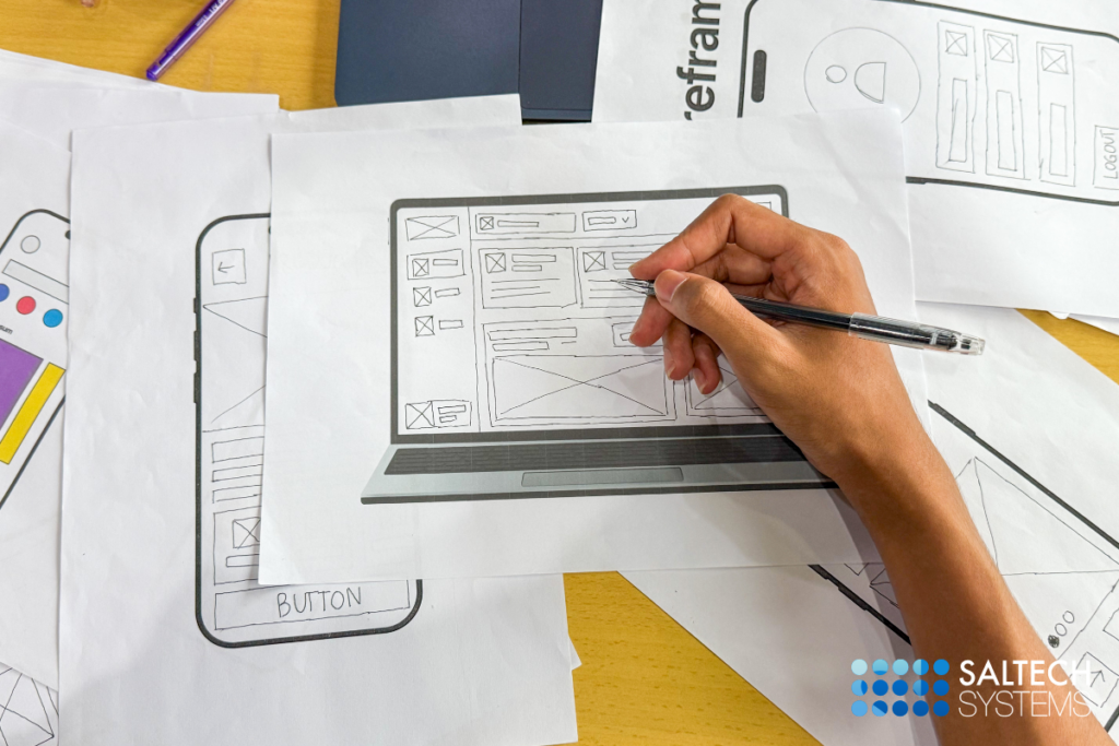

Apple’s homepage is proof that restraint can look expensive. The lesson worth taking isn’t “use less text.” It’s “earn the right to use less text” and most growing businesses get there through clarity, not by copying the surface.
It’s one of the most common design requests we hear: “Can our site feel like Apple’s?” The instinct makes sense. Apple’s pages are calm, confident, and unmistakably premium. What’s easy to miss is why that calm works. Apple has spent decades building recognition, so their homepage doesn’t need to introduce the company it only needs to show the newest product. Most businesses are still doing the introducing, which means the homepage has a bigger job to do.
That’s not a limitation. It’s actually a useful design brief. Below is a side-by-side look at what changes when a homepage is built for a brand everyone already knows versus a homepage built to win someone over for the first time.
What makes Apple’s approach work for Apple
Apple’s site leans on a few deliberate choices: enormous product photography, short and confident copy, spacious layouts, and navigation organized entirely around products people already recognize. None of it is accidental, and none of it is trying to do more than one job at a time. The site’s only task is to make an already-loved product look irresistible.
Why the same layout can underperform for a growing brand
Drop that same structure onto a business that isn’t yet a household name, and visitors are left filling in gaps the page never addresses: what the company actually does, who it’s for, and why it’s worth trusting. When those answers aren’t obvious within a few seconds, most visitors won’t stay to search for them.
Building a homepage that earns trust quickly
The good news is that clarity and beautiful design aren’t in competition. A homepage can be calm, modern, and spacious while still doing its job. A few things tend to make the biggest difference:
- A headline that states plainly who you help and how
- Visible proof, like results, reviews, or recognizable partners
- One clear next step, repeated without being pushy
- Imagery chosen to support the message, not to fill space
None of these require clutter. They just require design that’s built around a real strategy instead of a look borrowed from a brand in a different position.
How Saltech builds sites that look great and carry their weight
At Saltech, design and strategy happen together, not in sequence. Before we choose a layout, we map out who’s landing on the page, what they need to know, and what should happen next. That thinking shapes everything from the headline to the button placement, so the finished site feels as polished as the inspiration that started the conversation, while still doing the heavier lifting a growing brand needs.
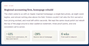
If a site already exists but isn’t converting, Saltech also runs focused audits to find exactly where visitors lose interest, whether that’s unclear messaging, a confusing layout, or a homepage that’s simply too quiet for a brand still building recognition.
The takeaway
Apple’s website earns its simplicity. Yours can earn a version of that same simplicity too just through clear messaging and proof, not through silence. Borrow the polish. Keep the explanation.
Frequently asked questions
1. Is it ever okay to use Apple’s website as design inspiration?
Yes, selectively. Apple’s use of white space, restrained color, and clean typography translates well to almost any brand. What doesn’t translate is the near-total absence of explanatory copy, which relies on recognition most businesses haven’t built yet.
2. Why can a minimalist homepage hurt conversions?
When a page strips out context, first-time visitors are left guessing about what the business offers and whether it’s trustworthy. Most won’t dig for answers they’ll simply leave, which quietly lowers conversion even on a beautiful page.
3. How much text should a homepage actually have?
Enough to answer the basics: what you do, who it’s for, and why someone should trust you. A short headline, a supporting line, a bit of proof, and a clear next step is usually plenty, as long as it’s easy to scan.
4. Can Saltech improve an existing site instead of rebuilding it?
Often, yes. Many underperforming sites just need clearer messaging, better hierarchy, or stronger trust signals. Saltech typically starts with an audit to see whether targeted changes or a full redesign will move the needle further.
5. How do I know if my site is too minimal for my brand?
Show the homepage to someone unfamiliar with your business for five seconds, then ask what the company does and who it serves. If they can’t answer confidently, the page is likely prioritizing looks over the information visitors actually need