The Evolution of Web Design Trends
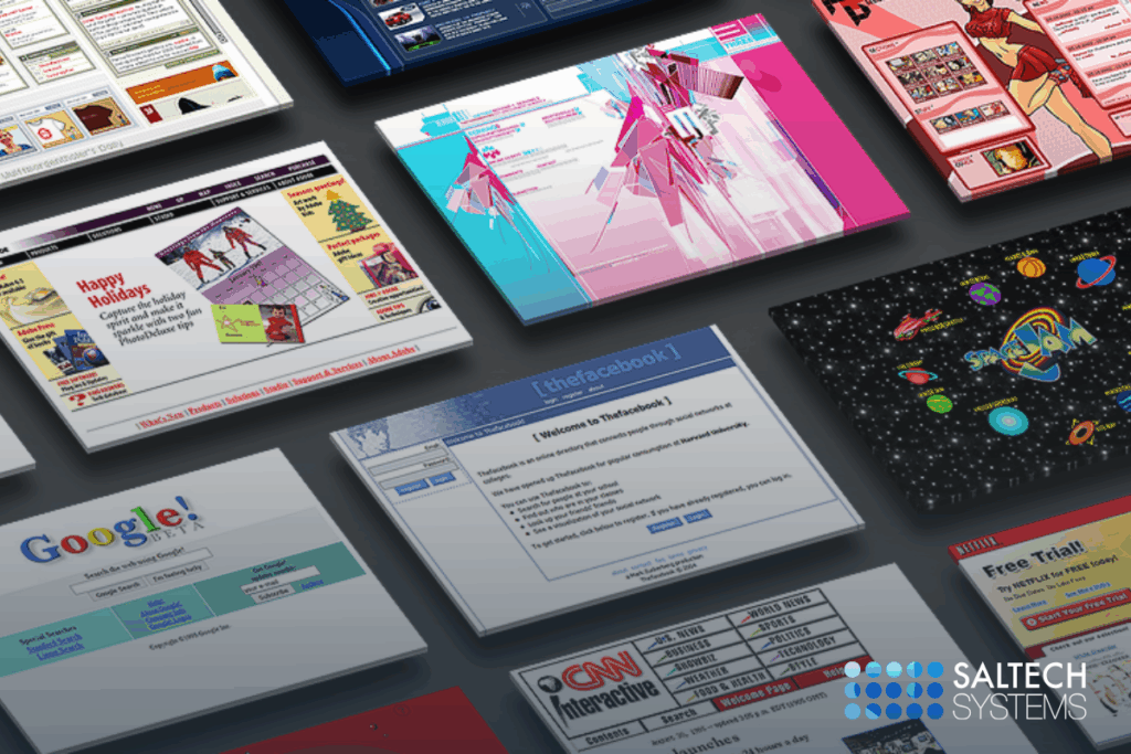
Web design has come a long way since the early days of the internet. From static HTML pages to immersive, mobile-friendly experiences, each generation of websites has pushed the boundaries of creativity , usability, and performance. Understanding the evolution of web design trends offers valuable insight for businesses and designers alike as they look to stay competitive in fast-changing digital world.
In this blog, we’ll explore ten key web design trends that shaped the evolution of website design over the years-and how these shifts influence today’s best practices.
The Static Era: Simplicity with HTML (1990’s)
In the early 1990’s, the first web design trends were static, text heavy, and built with basic HTML. These sites featured minimal graphics, in line styling, and often resembled digital brochures. While crude by modern standards, they laid the groundwork for the entire internet.
- Noble Features: Times New Roman font, underlined blue hyperlinks, and table-based layouts.
Learn more about how modern web development services can help you avoid outdated designs.
Flash Revolution ( Late 90’s- Early 2000’s)
Adobe Flash brought animation, interactivity, and multimedia to the web. Designers were finally free from HTMLs limitations, opening the doors to custom cursors, splash pages, and interactive menus.
- While Flash allowed for rich visuals, it often sacrificed usability, accessibility, and load speed- ultimately leading to its eventual demise.
Flas officially died in 2020, with most browsers ending support for the plugin. Why Adobe discontinued Flash.
The Rise of CSS & Separation of Concerns
As CSS (Cascading Style Sheets) became widely adopted in the early 2000’s, web designers could finally separate content from design.
- CSS enabled consistency and improved UX by allowing designers to define global styles and responsive rules.
Skeuomorphism & Realism
Inspired by real-world textures and interfaces, skeuomorphic design used shadows, gradients, and lifelike elements to stimulate reality. This trend peaked with Apple’s IOS 6 interface, where apps resembled leather notebooks and wooden bookshelves.
- Learn more about skeuomorphism here: What is Skeuomorphism?
Flat Design (2010’s)
Flat design was a direct response to Skeuomorphism. Minimalist, clean, and bold, flat design stripped away unnecessary textures in favor of bright colors, simple shapes, and intuitive icons.
- Popularized by Microsoft’s Metro UI and later adopted by Apple and Google- flat design emphasized functionality over flair.
Flat design laid the foundation for many modern UI/UX principles still used in today’s digital products.
Responsive Web Design (2010’2-Present)
As mobile browsing over took desktop, responsive web design became essential. Coined by Ethan Marcotte in 2010, responsive design allows a single website to adjust fluidly across all screen sizes.
- It uses flexible grids, media queries, and breakpoints to optimize layouts for phones, tablets, and desktops.
Learn more here: What is Responsive Web Design?
Contact Saltech Systems today to learn about our Web Design Services.
Mobile-First & Minimalism
Building on responsive design, the mobile-first philosophy designs for the smallest screens first-then scales up. This encourages streamlined interfaces, faster load times, adn content prioritization.
- Minimalism also became a dominant trend, aligning with users’ demands for clarity, speed, and accessible design.
Parallax Scrolling & Animation Effects
Parallax scrolling became one of the hot web design trends in the early 2010’s. It introduced a sense of depth by allowing background and foreground elements to scroll at different speeds. Combined with CSS animations and JavaScript libraries, it added movement and interactivity to static pages.
- when done right, these effects improved engagement. When overdone, they caused motion sickness or performance issues.
Dark Mode & Design System Standardization
With the rise of OS-level dark mode options, websites began offering dark themes for user comfort and battery efficiency. Simultaneously, design systems like Google Material Design & Apple’s Human Interface Guidelines brought consistency and scalability to large scale digital experiences.
- These systems created standards for spacing, color, accessibility, and interaction- improving cross-platforms UI consistency.
AI, Motion, & Microinteractions (2020’s)
Today’s web design trends incorporates AI-powered features, dark mode, microinteractions and motion design to create engaging, personalized experiences. Designers are blending aesthetics with the behavior driven UX that feels intuitive and emotionally intelligent.
Modern tools like Figma, no-code platforms and predictive analytics are also redefining how we design and deploy websites.
- Looking ahead and interested in future proofing your your site with smart design features? Contact us for a custom quote.
Looking Ahead: What’s next in Web Design?
The next phase of web design may include:
- Augmented Reality (AR) and Virtual Reality (VR)
- Voice interface design (VUI)
- Hyper-personalized content using AI
- Green web design for energy efficiency
Web design trends will continue to evolve in sync with technology and user behavior- and businesses must be ready to adapt.
Final Thoughts
From humble HTML beginnings to AI-driven interfaces, web design has transformed dramatically over the past few decades. Each era of innovation helped shape how we communicate, interact, and do business online.
Whether you’re planning a full website redesign or launching your very first website, staying current with web design trends isn’t about aesthetics—it’s about user trust, conversion rates, and long term growth.
Need help keeping up with the latest web design trends?
Visit Saltech Systems Web Services to learn how we can help you elevate your digital presence.