Green outline hexagon

How to effectively communicate your preferred website styles to your designer

blog-communicate-design-styles

Our web design process begins with a design survey, where we’ll ask a series of questions about your company and design preferences. This will provide our team with a comprehensive understanding of your needs and preferences, which will be discussed further in the kick-off meeting to ensure our design team is aligned with your vision.

Often, clients struggle to articulate their preferred design style, using vague descriptors like “I want my website to pop” or “I’m looking for a modern design.” These statements are a starting point for building your brand online. But understanding the following design styles will ensure nothing is lost in translation when our team takes over.

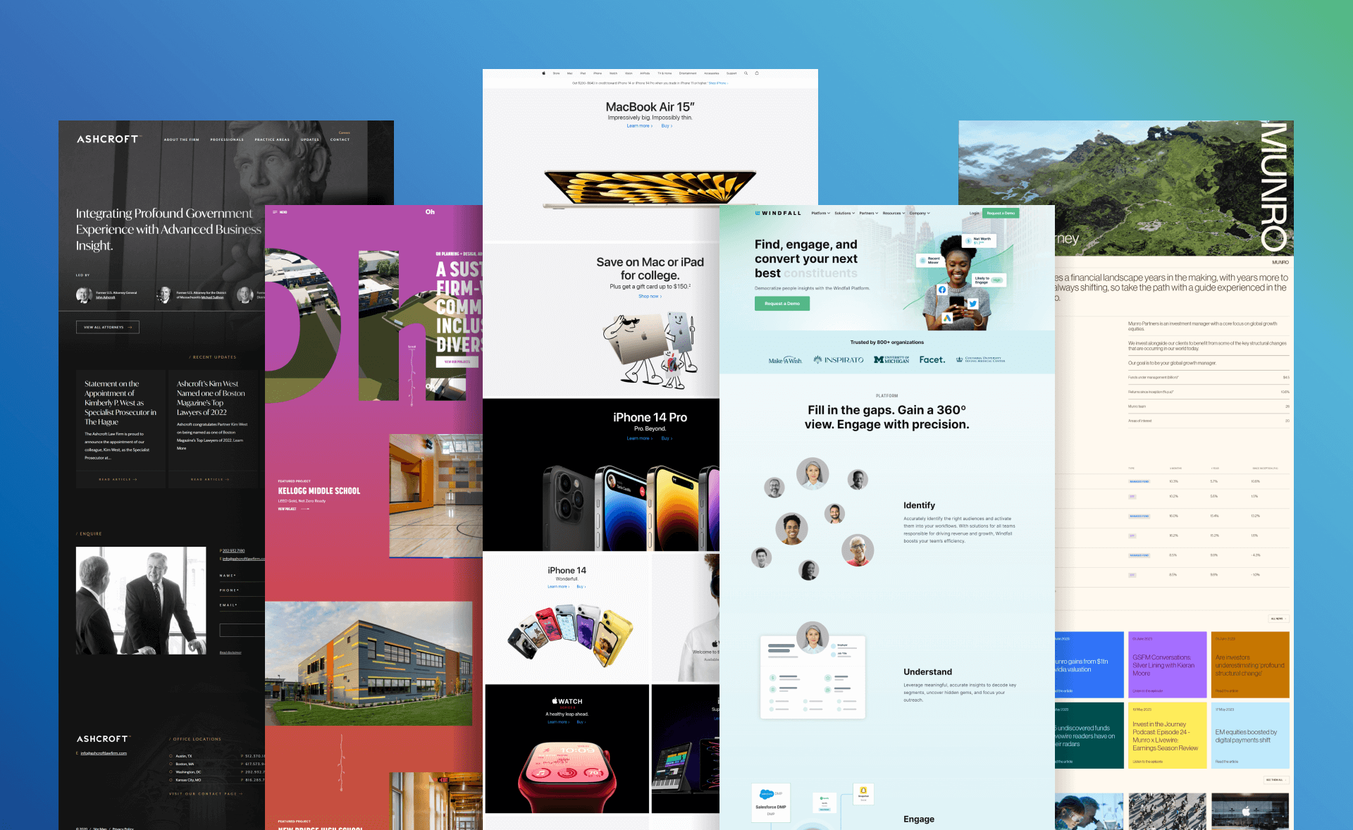
We’ve provided examples of common web design aesthetics, along with the typical design elements associated with each style.

Our mission is to communicate your brand accurately and attractively. Each element of your website should be chosen deliberately to tell your story and attract the right customers.

We hope this will assist you in making an informed decision regarding the design style of your new website.

Design Styles

The design styles we’ll discuss include: 

Branded / Unique Website Design

Branded/unique website design style is a design aesthetic that typically incorporates custom-made and personalized elements to create a unique, memorable, and recognizable feel. This is a great option if you have a well developed brand. This design style appeals to a target audience looking for a memorable and recognizable aesthetic. This is a great option for nearly any industry, but does require that you have a solid brand in place.

Common traits of the branded / unique website design style:

  • Features a specific color palette that is unique to the brand or company
  • Colors that convey a sense of personality and identity
  • Often features custom-made or unique type-faces that are exclusive to the brand or company 
  • Typography should convey a sense of individuality and authenticity
  • Custom-made and personalized layout that is unique to the brand or company
  • Focuses on the use of creativity and innovation to create a memorable and recognizable design
  • Includes images or illustrations that are specific to the brand, such as logos or mascots
  • Images that add a touch of personality and identity to the design
  • May include patterns or textures that are unique to the brand or company, such as a specific print or texture used in their products or packaging

Boho Website Design

The boho website design style is a design aesthetic that is characterized by a free-spirited, eclectic, and nature-inspired feel. This design style conveys a sense of creativity, individuality, and connection to nature that appeals to a target audience looking for a free-spirited and eclectic aesthetic. It’s a design style that emphasizes personalization and creativity, making it a popular choice for brands in the fashion, wellness, and lifestyle industries.

Common traits of the boho website design style:

  • Features a warm and earthy color palette, with colors such as brown, beige, rust, and mustard. 
  • Bright, saturated colors such as deep greens, oranges, and blues are also used.
  • Handwritten or script fonts convey a sense of personalization and individuality
  • Use of bold typography and negative space creates a dynamic and visually engaging design
  • Incorporates an eclectic mix of design elements, such as different textures, patterns, and shapes
  • Use of organic shapes and asymmetrical layouts creates a sense of freedom and creativity
  • Includes nature-inspired imagery, such as floral or leafy patterns, nature scenes, and rustic textures

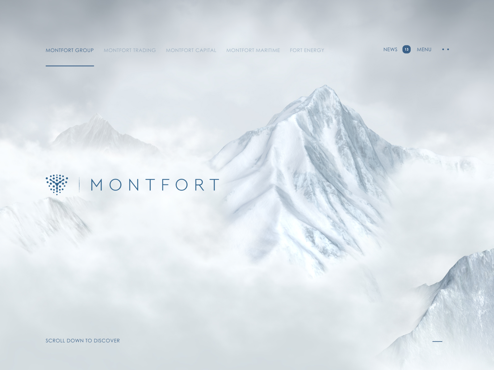
Clean & Simple Website Design

The clean and simple website design style conveys a sense of clarity, simplicity, and ease of use that appeals to a target audience looking for a straightforward and minimalist aesthetic. It’s a design style that emphasizes usability and functionality over unnecessary design elements.

Clean and Simple website design is a great choice for a timeless website in nearly any industry. Some industries that commonly use this style include: tech, finance, and professional services industries.

Common traits of the clean & simple website design style:

  • Limited color palette (2-3 colors)
  • Neutral colors such as white, black, gray, or muted colors to convey a sense of cleanliness and simplicity
  • Any sans-serif font that is easy to read
  • Large text and bold typography with plenty of negative space
  • Grid-based layout
  • Ample white space
  • Minimal design elements
  • Clean lines & simple shapes
  • Any sans-serif font that is easy to read
  • Large text and bold typography with plenty of negative space
  • User experience is a top priority
  • Easy to use navigation
  • Clear call to actions
  • Fast loading times 

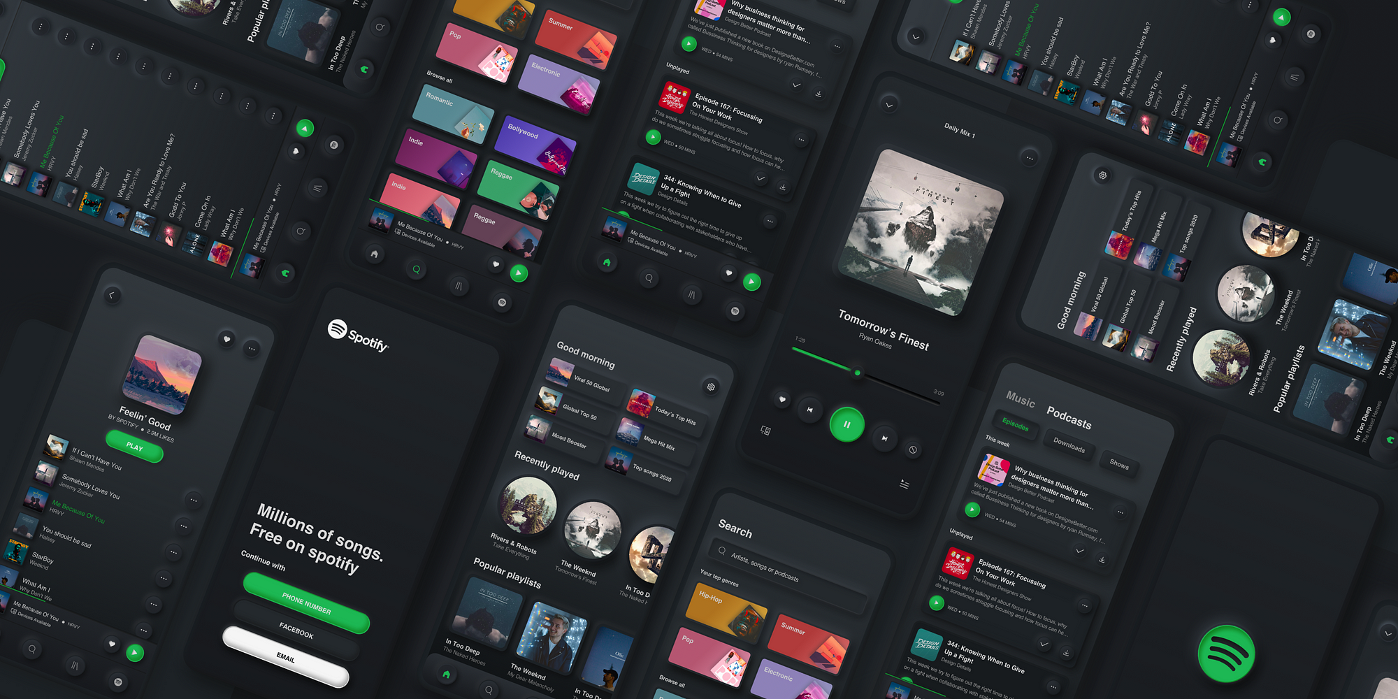
Dark Mode Website Design

The dark mode website design style is a design aesthetic that utilizes a dark color scheme to create a visually striking, moody, and futuristic feel. This design style conveys a sense of mystery, sophistication, and stylistic appeal that appeals to a target audience looking for a visually striking and dramatic aesthetic. It’s a design style that is popular among brands in the technology, fashion, and creative industries, as it emphasizes modernity and innovation.

Common traits of the dark mode website design style:

  • Dark background colors such as: black, dark gray, and dark blue
  • Contrasting font & accent colors such as white, light gray, or bright colors to create a visually striking effect.
  • Bold & large typography that is easy to read against the dark background
  • Sans-serif fonts are a common choice for their clean and modern look
  • Minimalist and clean layouts
  • Focus on negative “white” space and high contrast
  • Use of geometric shapes and lines adds a sense of modernity and sophistication
  • High-Contrast and moody imagery featuring shadows, silhouettes and dark backgrounds
  • Image with a transparent background are also a commonly used, this is a unique method to make your images stand out against the dark background

Feminine Website Design

Feminine website design style is a design aesthetic that typically incorporates soft, delicate, and elegant elements to create a warm, inviting, and feminine feel. This style appeals to a target audience looking for a soft and delicate aesthetic, making it a popular choice for brands in the beauty, fashion, and wellness industries.

Common traits of the feminine website design style:

  • Features soft, pastel colors such as pink, lavender, and light blue
  • Can incorporate warmer colors such as peach, coral, and rose gold as well
  • Elegant and delicate typefaces
  • Serif, script or cursive fonts, convey a sense of femininity and sophistication
  • Clean and minimalistic layout
  • Utilizes a large amount of negative “white” space
  • Focuses on the use of symmetry and balance to create a sense of harmony
  • Bright and soft images that incorporate colors from your brand
  • Images that add a touch of delicacy and softness to the overall design
  • May include patterns such as floral or lace that add a feminine touch to the overall design

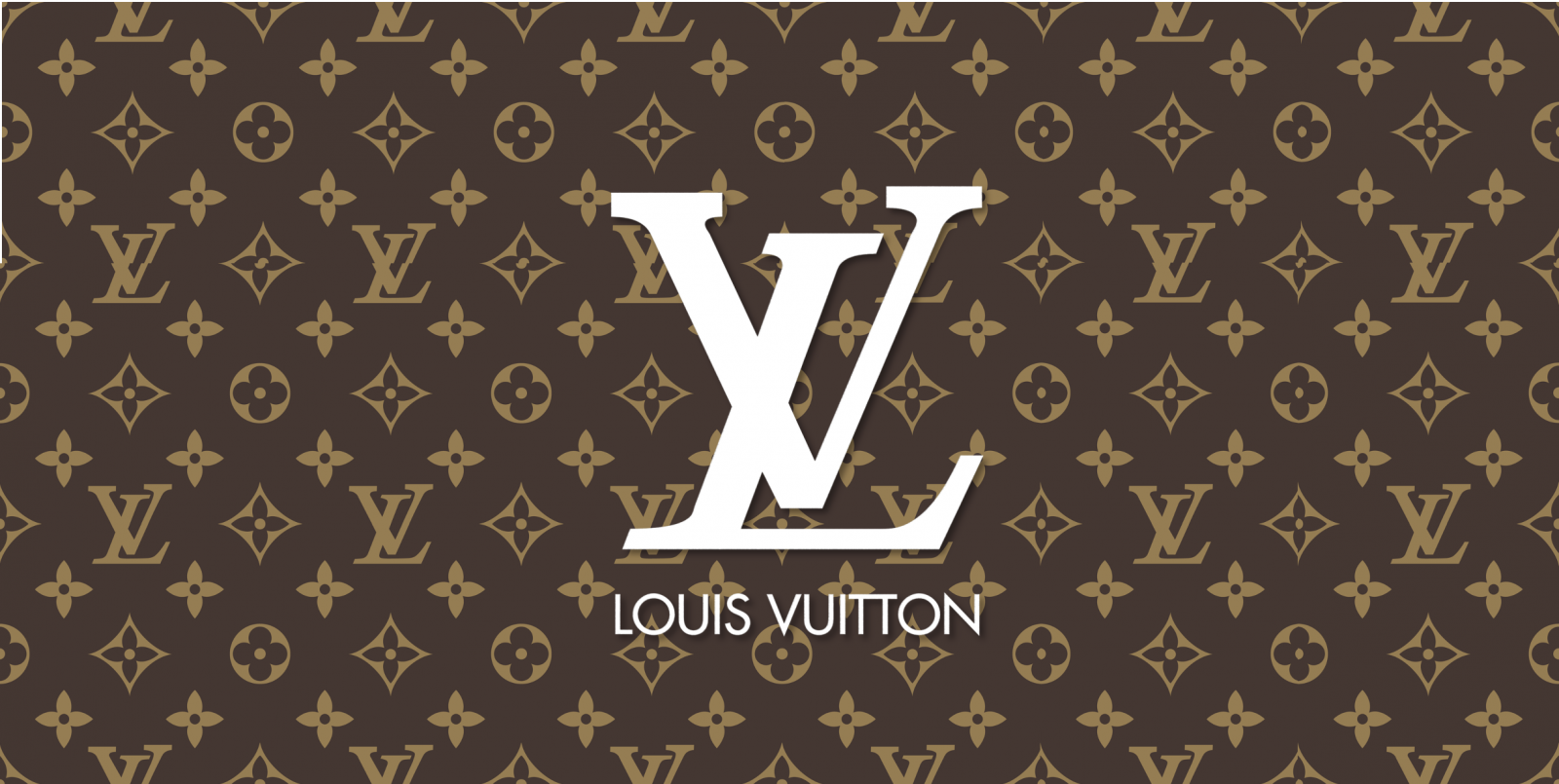
Luxurious Website Design

Luxurious website design style is a design aesthetic that typically incorporates high-end, lavish, and exclusive elements to create a sophisticated, glamorous, and opulent feel. This design style appeals to a target audience looking for a high-end and luxurious aesthetic. This is a great aesthetic for the following industries: high-end fashion and jewelry, high-end makeup/beauty products, high-end real estate, fine dining, luxury spas/resorts, financial and wealth management.

Common traits of the luxurious website design style:

  • Rich, deep, and bold colors such as gold, silver, or dark purple that evoke a sense of luxury and elegance.
  • Elegant and sophisticated typefaces
  • Serif fonts with thin or delicate strokes which convey a sense of refinement and exclusivity
  • Clean and spacious layout
  • Focuses on the use of negative “white” space and symmetry to create a sense of elegance and luxury
  • Includes very professional, bright photos
  • Images that add a touch of sophistication and glamor to the design

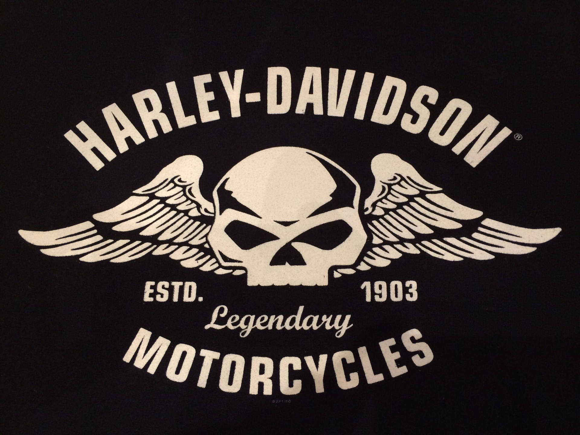
Masculine Website Design

Masculine website design style is a design aesthetic that typically incorporates bold, strong, and angular elements to create a powerful, confident, and masculine feel. This style appeals to a target audience looking for a bold and powerful aesthetic, making it a popular choice for industries that tend to have a male-dominant target audience such as, automotive, technology, sport, and construction.

Common traits of the masculine website design style:

  • Features strong, bold colors such as black, navy blue, or gray
  • Also commonly incorporates warm and earthy colors such as brown or rust.
  • Bold and strong typefaces
  • Sans-serif fonts, which convey a sense of masculinity and confidence
  • Bold and asymmetrical layout
  • Focuses on the use of contrast and hierarchy to create a sense of strength and power
  • High contrast, dark and powerful imagery
  • Also incorporates geometric shapes or arrows
  • Images that add a touch of strength and power to the overall design

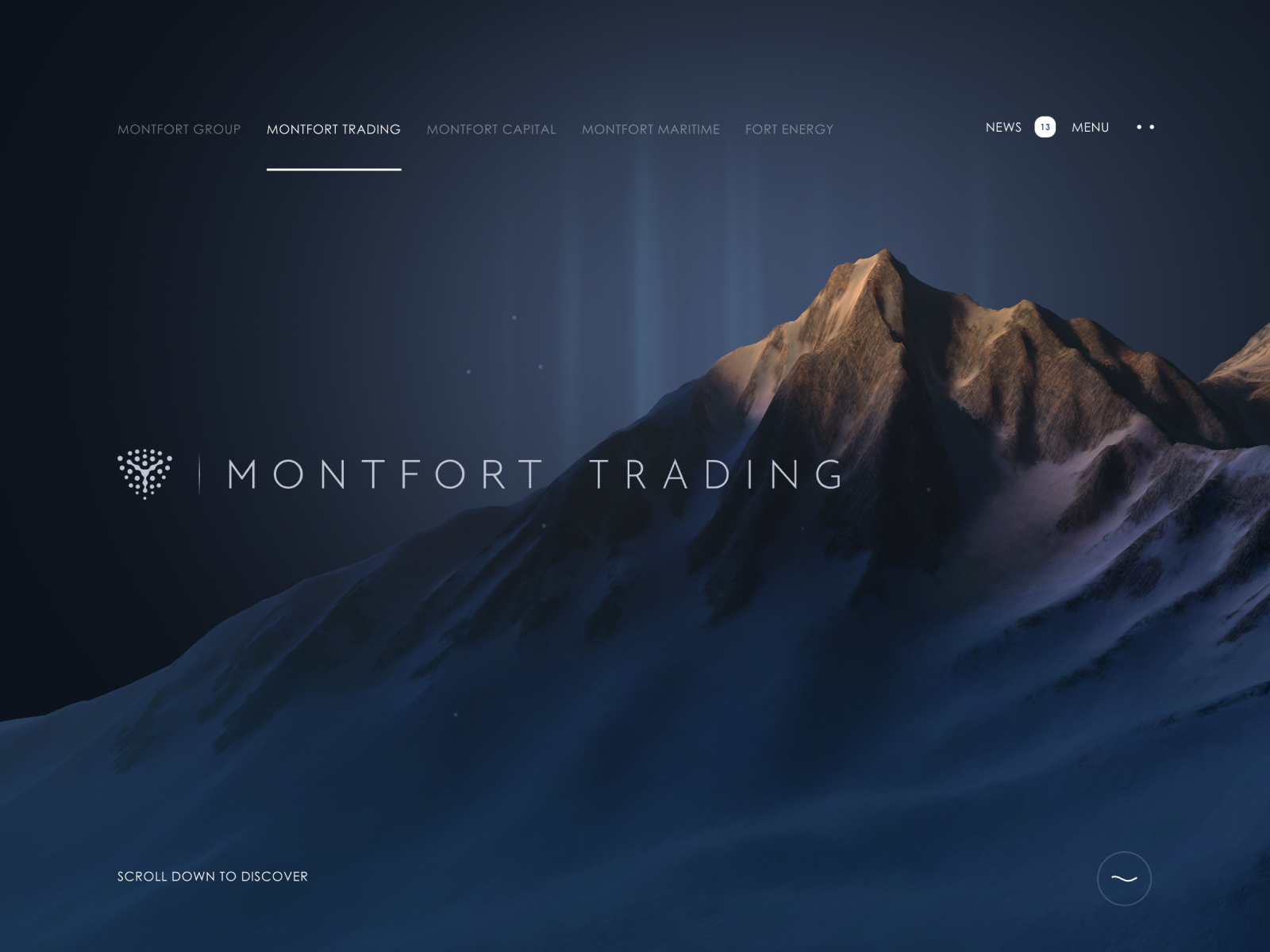
Modern Website Design

Modern website design style is a design aesthetic that is characterized by a sleek, minimalist, and high-tech feel. Contemporary website designs follow the same “Clean and Simple” aesthetic described earlier, but with a trendier approach. The modern website design style conveys a sense of sophistication, simplicity, and high-tech appeal that appeals to a target audience looking for a sleek and contemporary aesthetic. 

Common traits of the modern website design style:

  • Dark background colors such as: black, dark gray, and dark blue
  • Contrasting font & accent colors such as white, light gray, or bright colors to create a visually striking effect.
  • Bold & large typography that is easy to read against the dark background
  • Sans-serif fonts are a common choice for their clean and modern look
  • Minimalist and clean layouts
  • Focus on negative “white” space and high contrast
  • Use of geometric shapes and lines adds a sense of modernity and sophistication
  • High-Contrast and moody imagery featuring shadows, silhouettes and dark backgrounds
  • Image with a transparent background are also a commonly used, this is a unique method to make your images stand out against the dark background

Organic & Natural Website Design

The organic website design style is a design aesthetic that typically incorporates natural and environmentally friendly elements to create a fresh, clean, and calming feel. The organic website design style appeals to a target audience looking for a natural and pure aesthetic. It’s a design style that promotes a healthy and calming lifestyle, making it a popular choice for brands in the wellness, health, and eco-friendly industries.

Common traits of the organic & natural website design style:

  • Often features natural colors such as green, brown, beige, or blue that reflect nature and the environment
  • Clean and simple typefaces
  • Sans-serif fonts with rounded edges convey a sense of calmness and tranquility
  • Simple and clean layout
  • Focus on negative “white” space
  • Use of natural textures, and organic shapes to create a sense of openness and tranquility
  • Light and crisp photos that match the brand
  • Images that add a touch of freshness and authenticity to the overall design

Professional / Corporate Website Design

Professional, or corporate website design style is a design aesthetic that typically incorporates clean, modern, and minimalist elements to create a serious, credible, and professional feel. This design style appeals to a target audience looking for a serious and trustworthy aesthetic. This is a popular choice for almost any industry whose target audience includes professionals, such as, legal, finance, healthcare, education, corporations, and government organizations.

Common traits of the professional / corporate website design style:

  • Features neutral colors such as white, gray, or black
  • Can also utilize muted colors such as blue or green to help convey a sense of professionalism and credibility
  • Clean and simple typefaces
  • Sans-serif fonts, which convey a sense of professionalism and clarity
  • Simple and organized layout
  • Focuses on the use of space and structure to create a sense of clarity and order
  • Typically includes professional images of business-related elements
  • Images of offices, meetings, or people in professional attire
  • Images that add a touch of seriousness and professionalism to the design

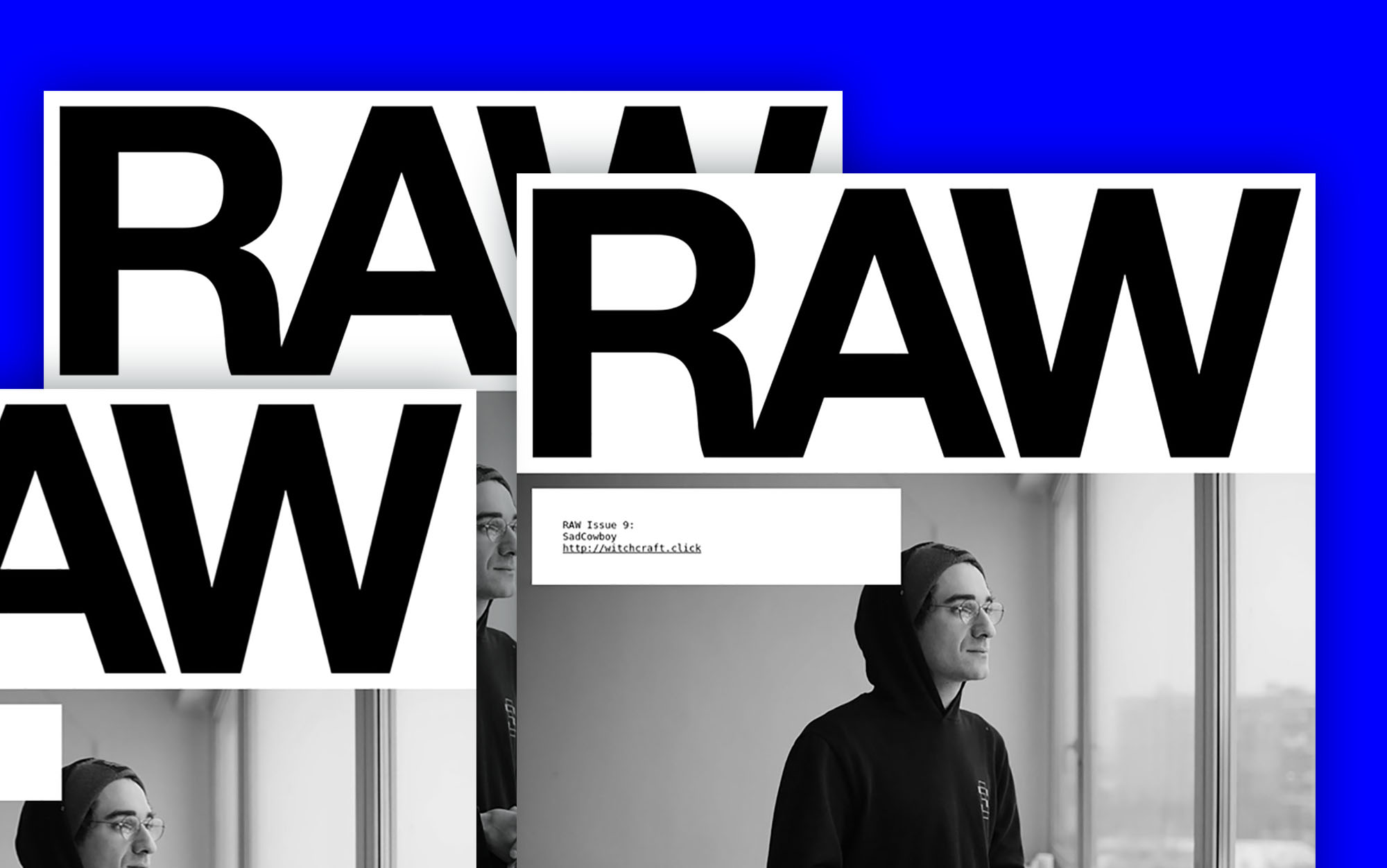
Unconventional Website Design

The unconventional website design style is a design aesthetic that is characterized by a non-traditional approach to web design. This design style conveys a sense of creativity, innovation, and experimentation that appeals to a target audience looking for a unique and unexpected aesthetic. It’s a design style that emphasizes individuality, creativity, and innovation, making it a popular choice for brands in the art, creative, music, and technology industries.

Common traits of the unconventional website design style:

  • Often features bold and unexpected color combinations
  • Contrasting and complementary color schemes
  • Use of vibrant and unexpected color combinations creates a visually striking design
  • Unique and experimental typography
  • Fonts incorporate unusual shapes, sizes, and arrangements
  • Use of custom typefaces, variable fonts, and interactive typography creates a visually interesting and engaging design
  • Often incorporates an asymmetrical and irregular layout
  • Unexpected design elements break away from traditional grid-based layouts
  • Use of overlapping elements, unusual shapes, and unusual scrolling techniques creates a unique and unexpected design
  • Typically includes a mix of different types of imagery, such as photography, illustrations, and graphics
  • Use of unexpected and abstract imagery, animated backgrounds, and interactive elements creates a visually engaging and unconventional design
  • Prioritizes a unique and engaging user experience
  • Features interactive animations, unusual navigation techniques, and unconventional content layouts

Vintage Website Design

Vintage website design style is a design aesthetic that typically incorporates elements from the past to create a nostalgic, timeless, and charming feel. This design style appeals to a target audience looking for a timeless and classic aesthetic. Industries include, antique stores, coffee shops, restaurants, and home décor.

Common traits of the vintage website design style:

  • Features muted or pastel colors such as beige, cream, or soft yellow
  • Can also utilize dark and rich colors such as burgundy, navy, or forest green that evoke a sense of nostalgia
  • Script or serif typefaces with a retro feel, which convey a sense of elegance and charm.
  • Classic and elegant layout
  • Focuses on the use of symmetry and balance to create a sense of harmony
  • May include imagery with a vintage effect or filter added to it
  • Images that add a touch of nostalgia and charm to the design
  • Can include patterns such as floral, paisley, or polka dots that adds a touch of whimsy and charm

Whimsical / Playful Website Design

The whimsical website design style is a design aesthetic that is characterized by a playful, imaginative, and lighthearted feel. This design style appeals to a target audience looking for a lighthearted and creative aesthetic. It’s a design style that emphasizes creativity, individuality, and imagination, making it a popular choice for brands in the entertainment, children’s products, and creative industries.

Common traits of the whimsical / playful website design style:

  • Utilizes a bright and colorful palette
  • Pastel colors, bright shades, and playful hues
  • Contrasting colors and vibrant hues creates a visually interesting and playful design.
  • Handwritten or cursive fonts
  • Features fun and playful typography with irregular shapes, sizes, and arrangements
  • Fonts can also incorporate flourishes, swashes, and icons to create a playful and imaginative feel
  • Incorporates an asymmetrical and playful layout with a mix of design elements that are not necessarily related
  • Overlapping text, quirky icons, and playful shapes creates a visually interesting and unique design
  • Includes playful and imaginative imagery such as cartoons, illustrations, and quirky graphics
  • Imaginative and whimsical characters, shapes, and patterns creates a visually engaging and playful design
  • Often prioritizes a user-friendly experience
  • Features easy navigation, clear calls to action, and engaging visuals

When your website design agency asks about the types of websites you admire, it’s crucial to consider the bigger picture. While usability is important, don’t overlook the more subtle design elements that appeal to you, such as vibrant colors, playful typography, and generous whitespace. By providing these details to your web designer, you’ll provide them with a clear and specific direction to craft a website that resonates with your style and preferences.

Facebook
Twitter
LinkedIn
decorative icon
Green outline hexagon
White outline hexagon

Transform your business with a new website

Web & Graphic Design

Let's Start a Project

This field is for validation purposes and should be left unchanged.

Limited Time Offer!

Ready to upgrade services?
Now is the perfect time! We’re offering up to 20% off when adding a service or signing up for multiple

decorative icon
Green outline hexagon
White outline hexagon

Transform your business with a new website

Get a free quote

Which services are you interested in?(Required)
This field is for validation purposes and should be left unchanged.

Limited Time Offer!

Ready to upgrade services?
Now is the perfect time! We’re offering up to 20% off when adding a service or signing up for multiple