Portfolio / Web Design

Web Design Project: Inspecting Iowa

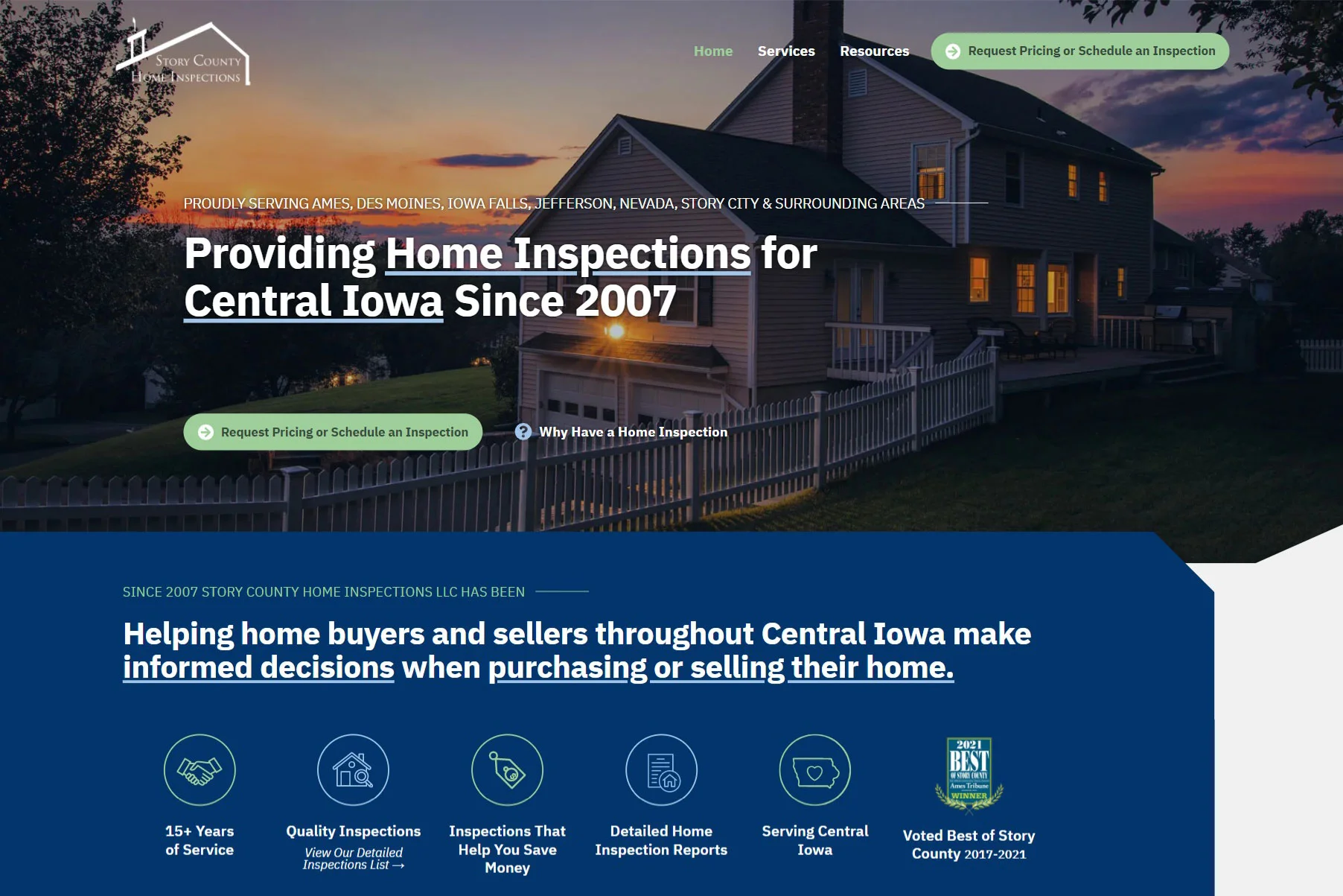
screenshot of story county home inspections website
Industry

Real Estate & Property Management

Professional Organization

Service & Leisure

Project Features

Custom Forms

Photo Galleries

Blog Posts

About the project

Project Brief: Story County Home Inspections came to Saltech Systems wanting a new website. Their current website was very outdated and not visually appealing. It was very wordy, hard-to-read, and not attractive to users.
Our Solution: The new website design for Story County Home Inspections (dba Inspecting Iowa), features a warm and bright design, along with photos, icons, and headings to break up the content and make it easier for users to read. We also wrote new content for the website that is more focused on educating the website on users on the importance of getting a home inspection done.
mockup of story county home inspections website

The results are transformational

Before:

After:

screenshot of story county home inspections original website Screenshot of story county home inspections website

My old website was long outdated, and it was time to have it updated. Over the past three years and working with two different part-time web designers, I still did not have a new site. I had a lot of broken promises and excuses, but not even a rough draft of what the new site would look like. Looking back on it now, their portfolios of sites created were small and their sites looked cookie cutter. I really would not have been any better off than I was three years ago. Before doing a Google search for web designers, I asked for recommendations on Facebook. Through this, I discovered Saltech. I made contact with Melissa, and we set up a design meeting. Prior to the meeting, Melissa asked that I look at other websites to see what I liked and what I did not like. After looking at my old site and through multiple others, it was clear that most businesses use discount designers resulting in the cookie cutter look. I was able to determine what I did not want my site to look like. At the same time, I could not really describe how it should. Because of this, I did not know what to expect moving forward. At the end of our design meeting, Melissa and Holly insured me that they would create a website that sets me apart from the competition. Six weeks after initial contact we are now in the final edits as the site is set to be released. Saltech has completely surpassed anything that I could have envisioned.

— Jeff Spencer, Owner and Home Inspector

Dark Grey hexagon
Blue hexagon
Green hexagon
Let's build something great together!

Impressed by our work? Let's start on your project!

Our work speaks for itself

Recent web design projects

Blue hexagon
Green outline hexagon
White outline hexagon

Web & Graphic Design

How can we help?

Thanks for choosing Saltech Systems for your Web & Graphic Design needs! Fill out the form below to get started on your next project, or to inquire about our services! Our team will respond as soon as possible.

This field is for validation purposes and should be left unchanged.

decorative icon
Green outline hexagon
White outline hexagon

Transform your business with a new website

Web & Graphic Design

Let's Start a Project

This field is for validation purposes and should be left unchanged.

Limited Time Offer!

Ready to upgrade services?
Now is the perfect time! We’re offering up to 20% off when adding a service or signing up for multiple

decorative icon
Green outline hexagon
White outline hexagon

Transform your business with a new website

Get a free quote

Which services are you interested in?(Required)
This field is for validation purposes and should be left unchanged.

Limited Time Offer!

Ready to upgrade services?
Now is the perfect time! We’re offering up to 20% off when adding a service or signing up for multiple