About the Project
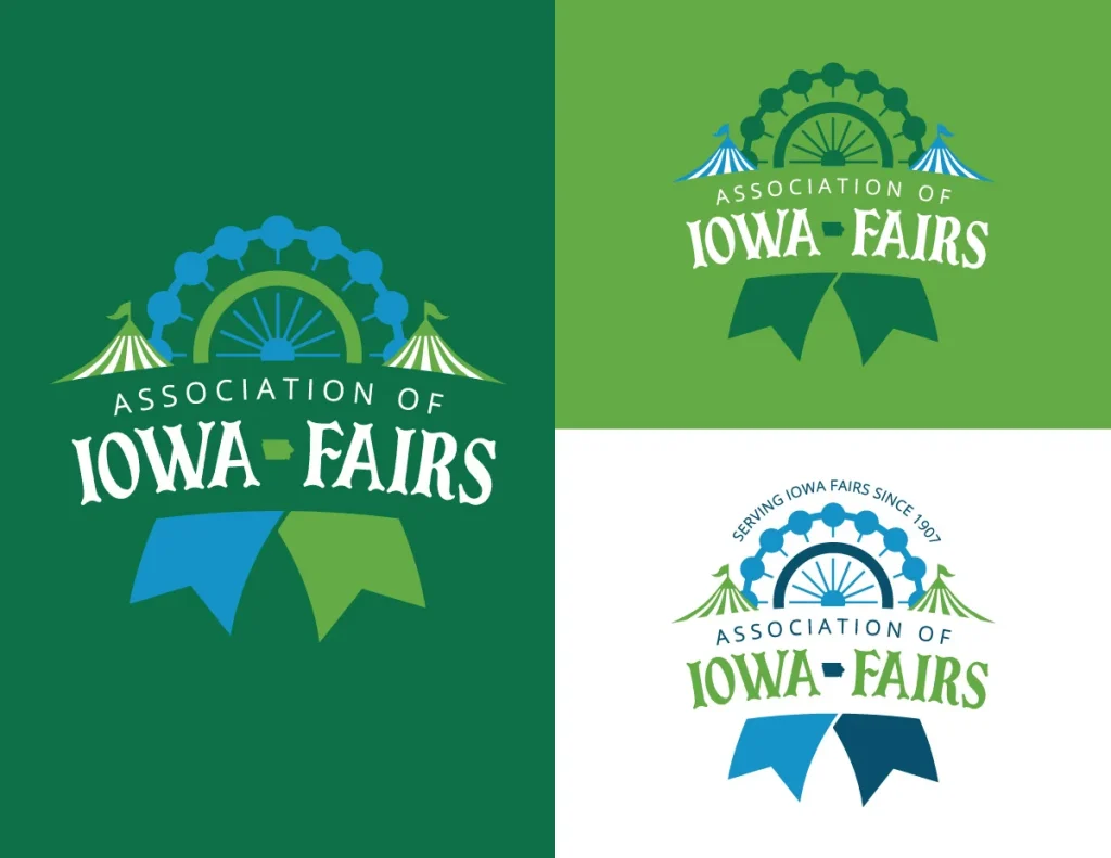
Project Brief: The Association of Iowa Fairs was formed in 1907 and they wanted a new, modernized logo to go with their new, redesigned website. They wanted to keep a similar green color, as well as fair graphics such as the ferris wheel and circus tents.
Our Solution: We used a similar but modernized ferris wheel imagery for the new logo, and combined it with a blue ribbon shape and circus tents to encompass various aspects of a fair. We also updated the font to a fun, modern version of a circus font.