About the Project
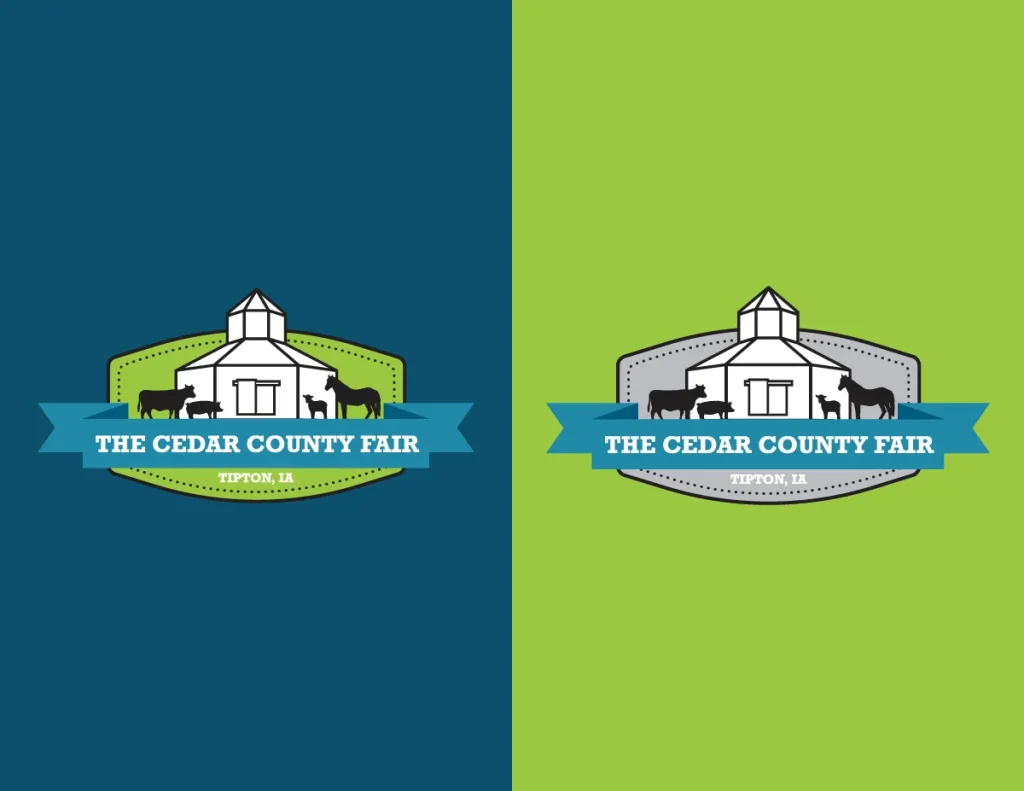
Project Brief: The Cedar County Fair came to Saltech Systems looking for a complete rebrand and a brand new logo. Their fair hosts multiple events, concerts, and exhibits during fair week – and is commonly referred to as, “The busiest 40 acres in Cedar County.”
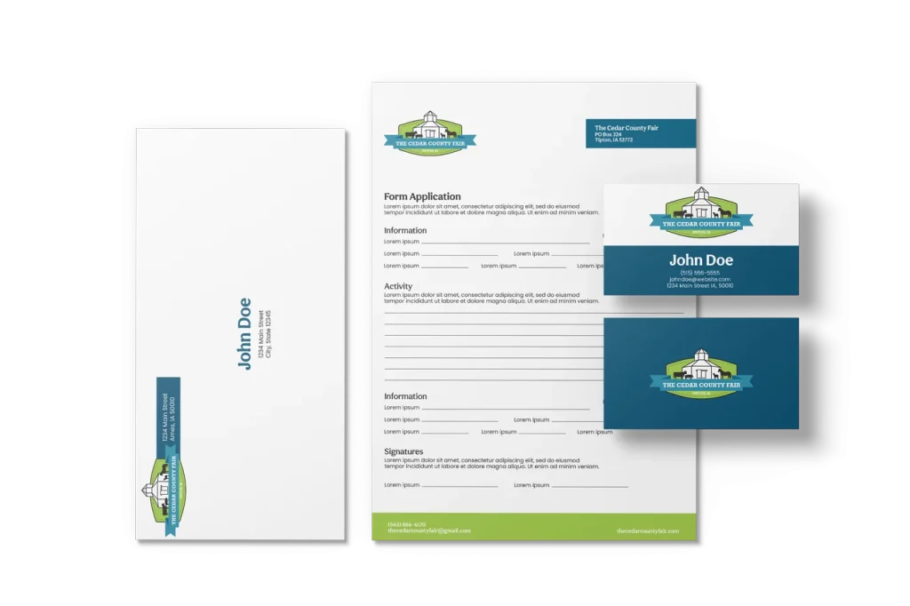
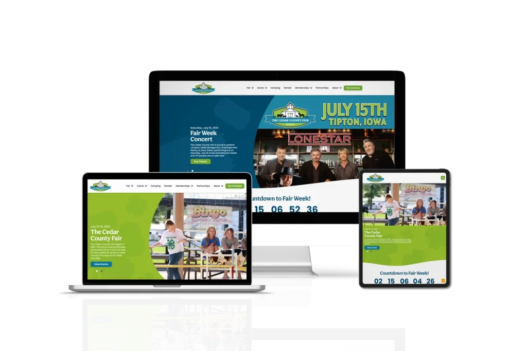
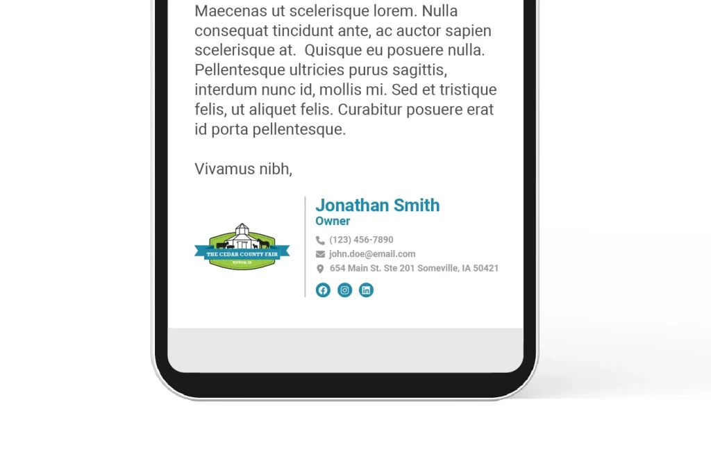
Our Solution: Saltech Systems redesigned The Cedar County Fair’s brand from the ground up, starting with a new color palette. They wanted their color palette to be bright and colorful, but still remain professional and trendy. Saltech’s designers developed an identity that included green for the primary brand color, muted blues as secondary, and gold as the supporting tertiary color. After the color palette, our designers focused on the icons and symbols that make The Cedar County Fair so special. These icons included rodeos, The Floral Hall, ribbons, and the animals. The final logo represents these items and pulls together the new colors they chose to showcase The Cedar County Fair’s new brand!