About the Project
Project Brief: Brigel Enterprises had been around for a long time, but never had any professional branding. While the client was expanding his businesses presence online he wanted to create a fresh brand identity to go along with it.
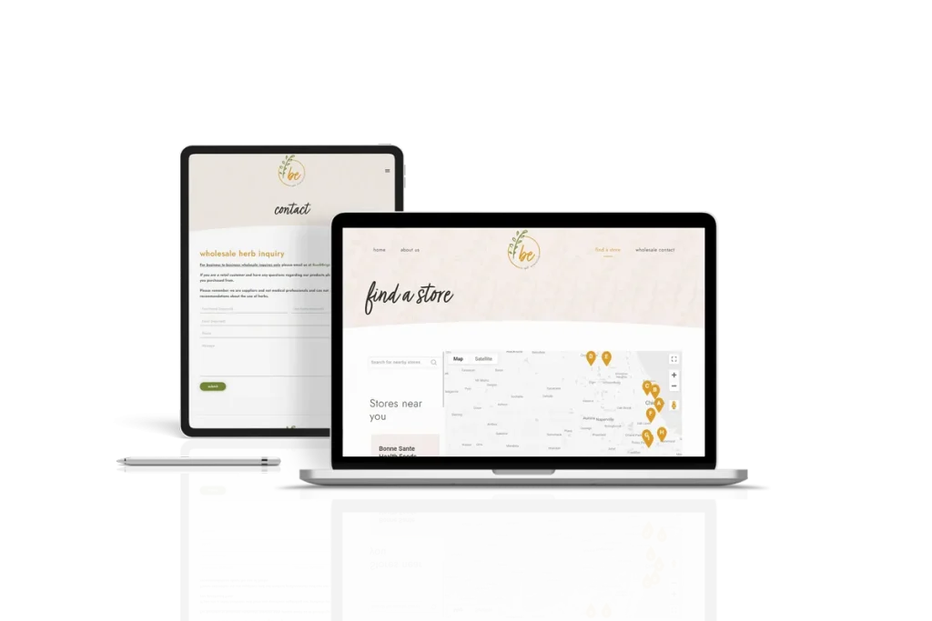
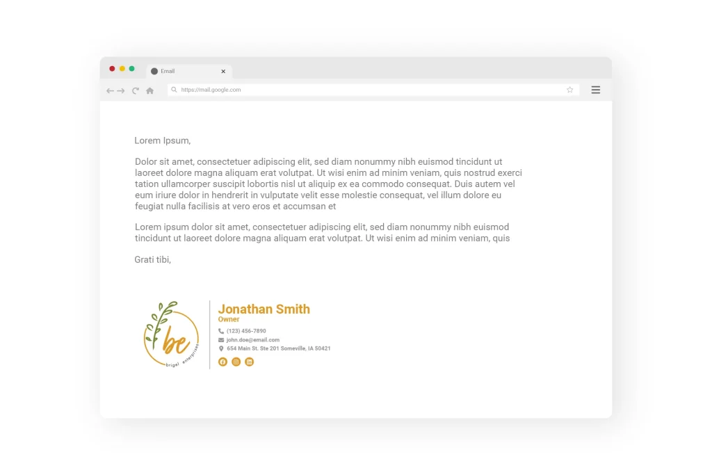
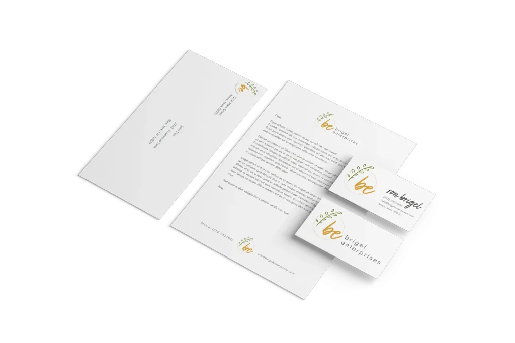
Our Solution: After creating a few different logo variations, the client immediately knew that he wanted this new logo to represent his brand. The logo features a connected script font, lowercase letters, neutral colors, and circular shape – these elements make the logo feel warm, soft and welcoming. While the logo feels soft and feminine, it is still neutral in color to welcome a wide audience and to represent it’s natural sources.