About the Project
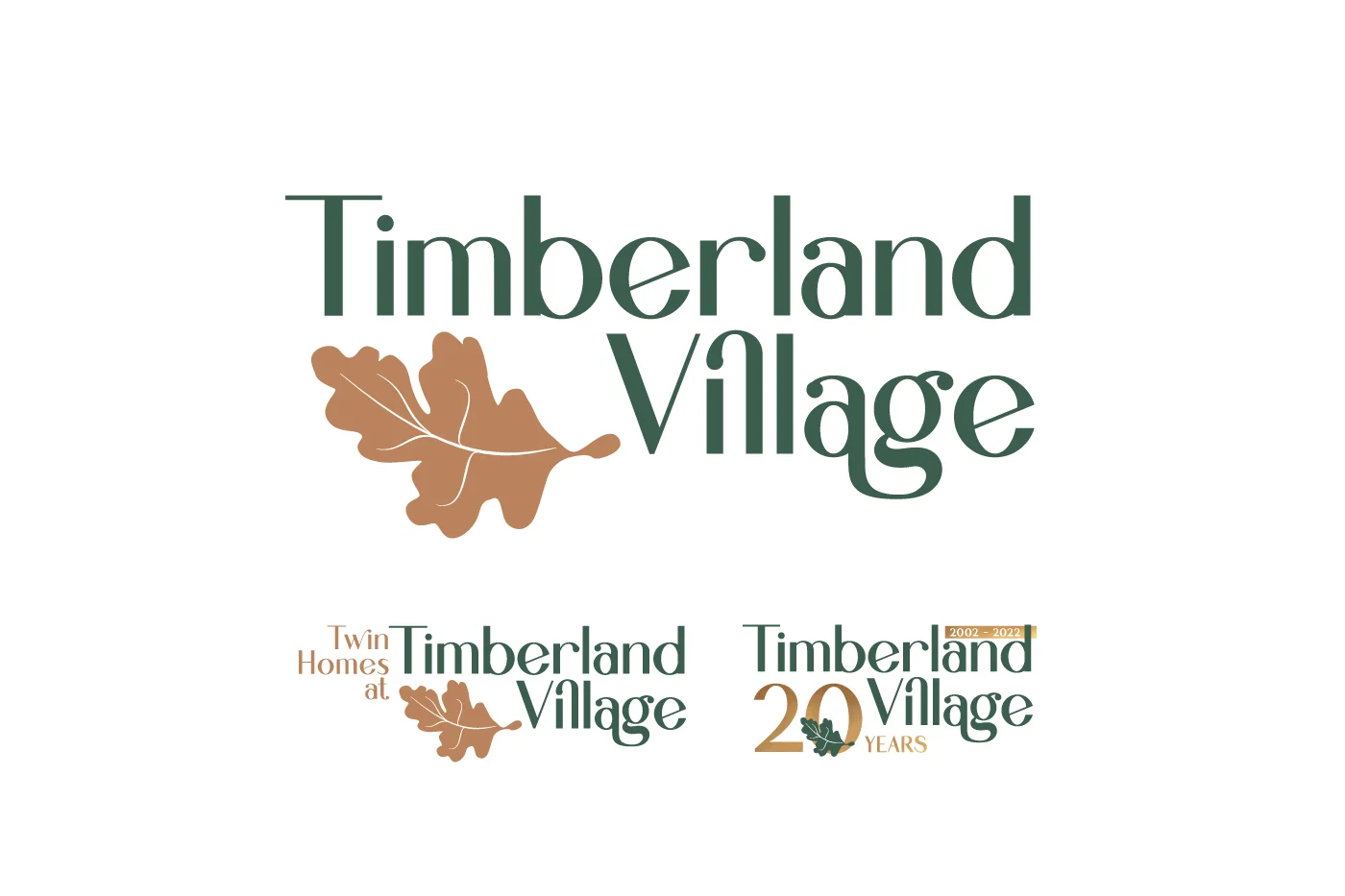
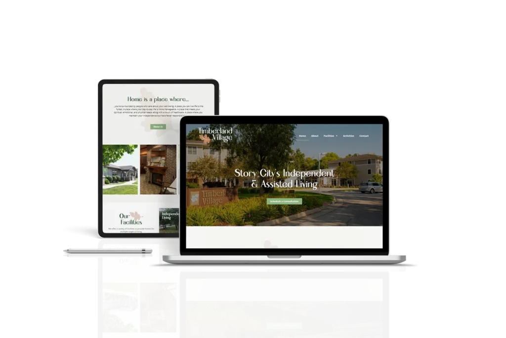
Project Brief: Timberland’s existing branding and logo design has been around since they opened up in 2002. Over the last 20 years moving between different design and marketing employees, the colors, fonts, etc. had been slightly adjusted overtime – leading to a not-so consistent brand image. For their 20th anniversary in fall 2022, Timberland village was hoping for a brand refresh – hoping to make their brand more consistent, modern, and more aligned with the look and feel of their beautiful community.
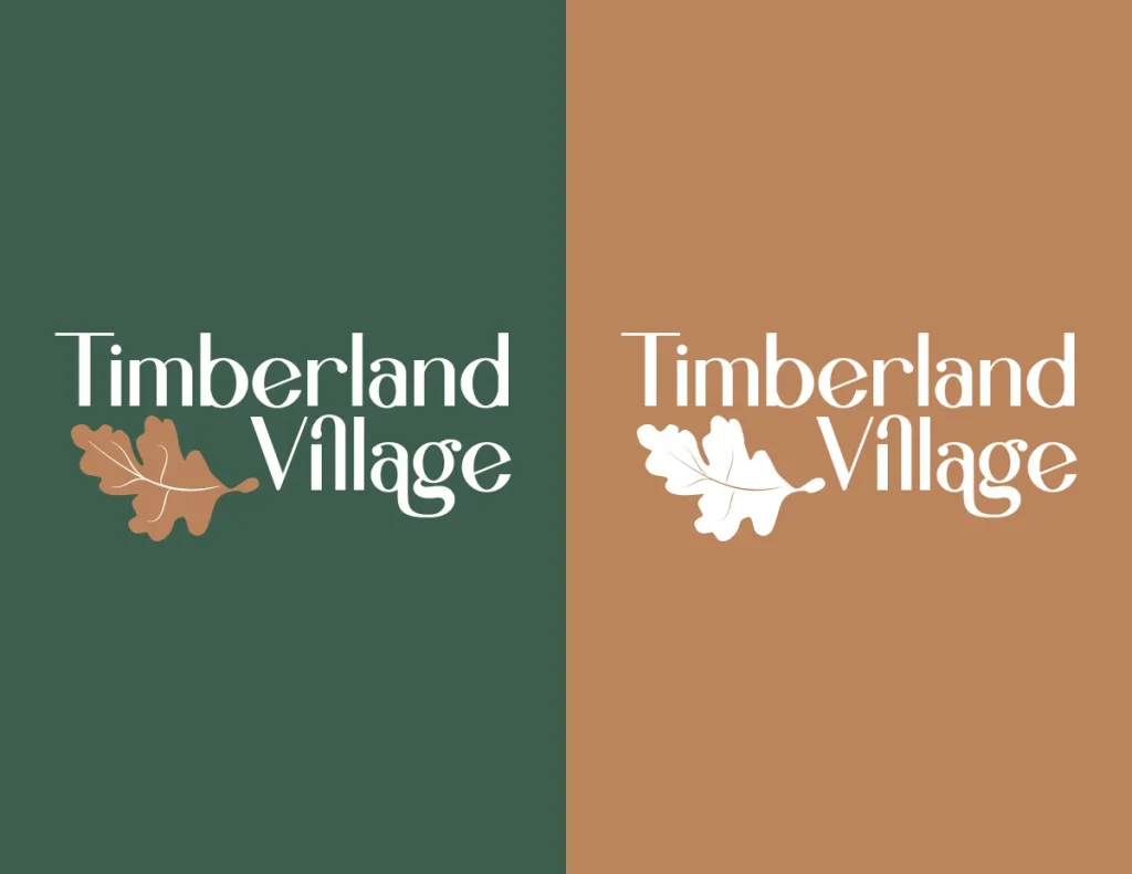
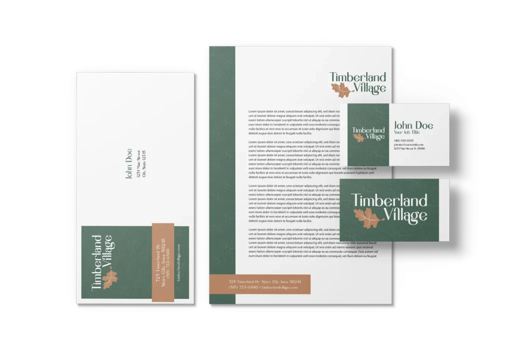
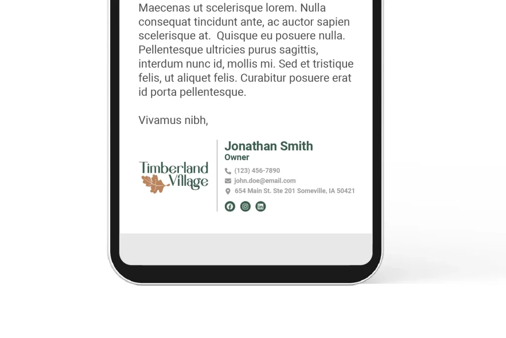
Our Solution: The leaf icon was an existing part of their brand since day one. We decided to keep that aspect of their original brand in order to keep the brand recognizable. We used a unique, yet classic and timeless sans-serif font for the primary logo. The colors of their brand were updated to a better brown color, and a complimentary green color was added to represent the natural feel of the senior living community. Secondary logos for their Twin Homes Retirement Village, and 20th anniversary were also created.