Simplifying Technologyâ„¢

Portfolio / Brand Design

Association of Iowa Fairs Branding

Association of Iowa Fairs - New Logo Design
Industry

Professional Organization

Government & Non-Profit

Project Features

About the project

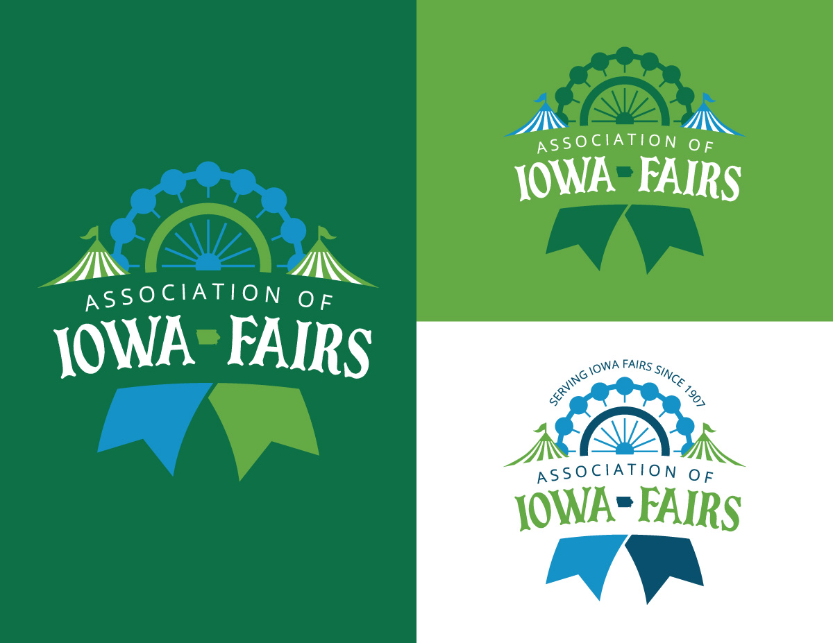
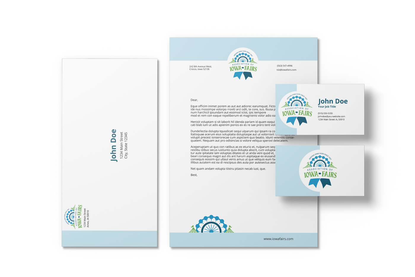
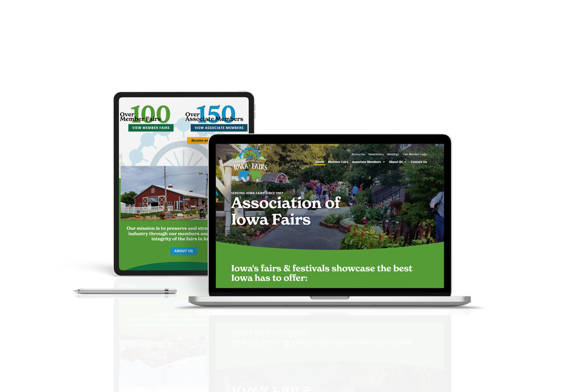
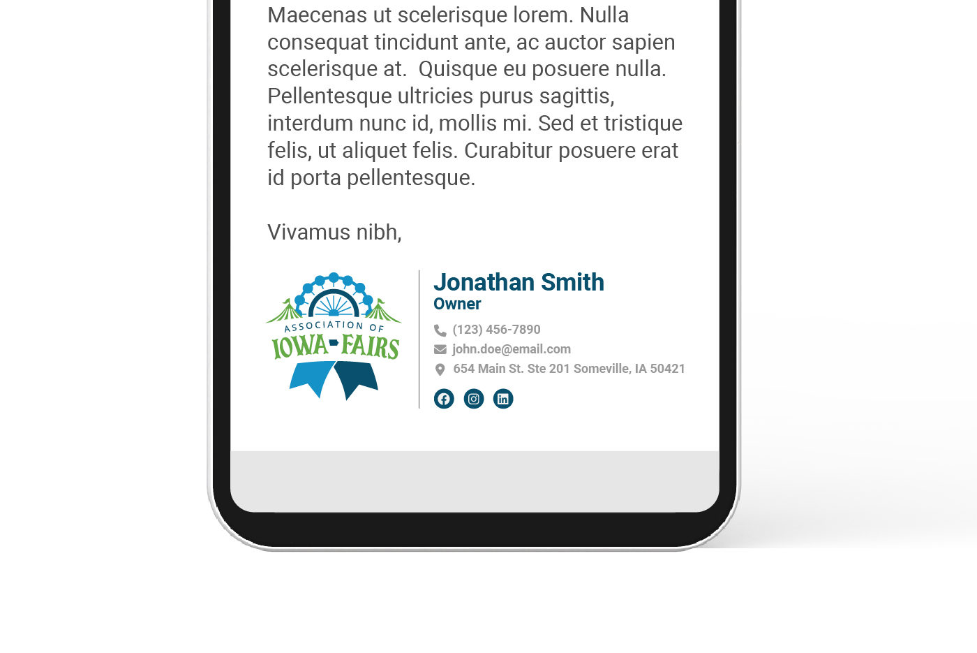
Project Brief: The Association of Iowa Fairs was formed in 1907 and they wanted a new, modernized logo to go with their new, redesigned website. They wanted to keep a similar green color, as well as fair graphics such as the ferris wheel and circus tents.
Our Solution: We used a similar but modernized ferris wheel imagery for the new logo, and combined it with a blue ribbon shape and circus tents to encompass various aspects of a fair. We also updated the font to a fun, modern version of a circus font.
Association of Iowa Fairs - letterhead mockup with new branding
Dark Grey hexagon
Blue hexagon
Green hexagon
Let's build something great together!

Impressed by our work? Let's start on your project!

Our work speaks for itself

Recent brand design projects

Simplifying Technologyâ„¢

Blue hexagon
Green outline hexagon
White outline hexagon

Web & Graphic Design

How can we help?

Thanks for choosing Saltech Systems for your Web & Graphic Design needs! Fill out the form below to get started on your next project, or to inquire about our services! Our team will respond as soon as possible.

This field is for validation purposes and should be left unchanged.